

August 29, 2023
Why does colour psychology make so much difference to us?
 In 2013, two Australian academics set out to discover the answer to a deceptively simple question. Why is there such a thing as colour psychology, but not shape, line or texture psychology? The answers they come up with are complex, arcane and wide-ranging but they manage to sum them up to some extent in the conclusion to the paper they published. “No other visual attribute shares such diverse representations”, they wrote. “Study into shape, line, and texture hardly competes. For this reason, there are no proportion-shape-line-texture prediction agencies, and chromotherapy is not challenged by proportion-shape-line-texture therapies. Colour remains special and, given its rich and complex heritage, is likely to remain so.”
It could be argued that it didn’t need such extensive analysis for them to reach this conclusion. We all know it instinctively, and that is the fundamental power of colour.
The proof of the special status of colour is evident in our language, which is replete with connections between colour and emotion. We see red and feel blue. We go puce with rage and are tickled pink. The envious are green and the cowardly yellow. We are encouraged not to engage in black and white thinking.
There is ongoing debate about the balance of cultural and evolutionary drivers for such notions, but what we know is that the link between colour and our thoughts and moods has long held a fascination for artists and philosophers and also has implications for the way we use colour in our surroundings.
If we look at our associations with brand and colours, for example orange equate to value (think Easyjet), luxury brand are more likely to be black, the colour of exclusivity (Black American Express, Chanel handbags) and of course green is associated with wellbeing and sustainability.
This in-built awareness of colour psychology is universal, even if the mechanisms are mysterious. As Pablo Picasso said, “colours, like features, follow the changes of the emotions.” Similarly, the great painter Piet Mondrian once suggested, it is the combination of colour with form that is essential: “The essence of painting has actually always been to make the Universal perceptible through colour and line.”
Unpicking the links
There have been attempts through history to unpick the links between colour and its effect on individuals. In the early 19th century, the German poet Johann Wolfgang von Goethe wrote his Theory of Colours, which was a treatise on the nature and function of colour in relation to mood and so an early exploration of colour psychology. Understandably based on his own observations rather than any science, he summarised his ideas somewhat in the now familiar mechanism of a colour wheel.
Even before Goethe, there were attempts to codify the way we see colour. The equally familiar form of the colour chart has been with us for much longer than we might suppose. The iconic Pantone chart can be dated to 1963, but the idea to represent colours in this way dates back at least to 1692 and a Dutch artist known only as A Boogert.
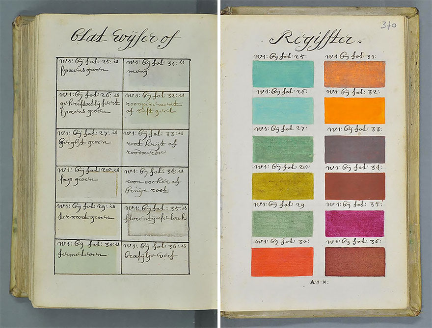 He painstakingly produced an 800 page manuscript known magnificently as the Traité des Couleurs Servant à la Peinture à l’Eau. Although it was intended to act as a standard reference work in the way we now use colour charts, the sheer amount of work in its production meant it was limited to only one copy and so of equally limited value for its purpose. It is kept in the library of the French town of Aix-en-Provence.
Although not strictly about colour psychology, the work is indicative of our unique fascination with colour. Although there are a lot of questionable claims in this realm, not least the idea of chromotherapy explored by the academics mentioned earlier, a growing body of academic and peer reviewed research is improving our knowledge of the mechanisms involved.
In 1985, Edward de Bono published Thinking Hats, a technique that can be used for exploring different perspective for a complex task or challenge very much rooted in the imapact colour has on humans. The colours are identified as; White – neutral, fact finding; Red – intuition and feeling; Black – stern and judging; Yellow -logical and positive; Green – creative and thinking; and finally Blue for the overview and control over the process.
This is a modelling theory that has been applied to task orientated working environments, and it makes perfect send to sit in a room that will stimulate creativity (green), or during an afternoon lull relocated to a red space to reinvigorate your mood.
A real link
A great deal of this is summed up in a 2015 paper by Professor Andrew Elliott who works in the Faculty of Psychology at Rochester University. The paper sets to unravel the growing body of research into the link between psychology and colour. It concludes that the link is very real but the processes involved remain unclear, including the roles of nature and nurture in developing our responses to colours.
That is not to say that we should hold off on developing practical applications based on our intuitions and experiences in combination with the research. Indeed, academics are using the same approach in their own work and drawing conclusions about how we might use colour to improve our surroundings and experiences.
These include researchers from University College London, who looked into how people use colour as a way of communicating emotions and how the knowledge they gained could be used to measure wellbeing. One of their interesting findings was that wile people often shared similar ways of communicating with specific colours and tones, they also exhibited different colour vocabularies.
The ideas arising from this became the subject of an interactive exhibition at the Slade School of Fine Art, underlining the point that colour psychology is both an art and a science.
This bears out our own experiences of developing products and working with clients on workplace projects. There is a great deal of science behind the way we create spaces and use materials and colours to connect with people, but there is an art to it too.
Colour is indeed special in the way we can all relate it to our emotions, thoughts and wellbeing. Everybody has an intuitive grasp of its importance. The growing body of research into colour psychology is essential, but so too is the way we feel about colours and their ability to communicate.
Colour by design
It’s become something of a cliché to say it nowadays, but over eighty per cent of what we absorb is communicated without words. A smell, a sound or a colour can convey an idea, fuel an emotion or evoke a memory. That is why designers try to develop new insights into the impact that the non-verbal has on people.
[perfectpullquote align=”right” bordertop=”false” cite=”” link=”” color=”” class=”” size=””]Colour is special but when it comes to the design of our surroundings it is never the only element[/perfectpullquote]
So while we know it would be wrong to apply hard and fast rules about the use of colour in design and on its impact on individuals as each person will interpret or feel differently about a particular colour depending on their experience, taste, education, and cultural associations. Yet we still work on the basis that some guidelines about our emotive response to colour can be applied to the general population.
We need to temper such generalisations in practice because they need to be applied in context and with due respect for their complexities. Our response to a colour will not only depend on our own in-built associations but our feelings about the form of a space and its textures, tones and lighting. Colour is special but when it comes to the design of our surroundings it is never the only element with which we work.

Abi Eskdale is International Marketing Manager at Woven Image