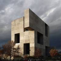
 One of the fundamental challenges when asked to offer a critique of something is that you may find that you actually like a great deal of what you are presented with. And this is precisely the challenge offered up by the shortlist for The Designs of the Year awards, organised annually by London’s Design Museum to honour work “that promotes or delivers change, enables access, extends design practice or captures the spirit of the year”. It would be churlish indeed to take issue with projects that seek to address the provision of education in deprived areas; remove pollutants from the air and from the oceans; advance technological solutions to help people with impaired sight or mobility and improve sanitation to eliminate the diarrhoea which kills approximately 1.8 million people annually, primarily children under the age of 5.
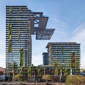 This shortlist is also mercifully free of the kind of phallocentric sky-scraping vanity projects that have come to blight our skylines over the past few years. One particular eyesore, the Central Park project (left) foisted on the citizens of Sydney, has crept on to the list sadly undisguised by the vertical gardens of celebrated artist and botanist, Patrick Blanc. Critics of the amount of maintenance and water that such vertical gardens require might find that this particular design trope jars against others that are, perhaps more usefully, concerned with water conservation.
A building that could transform to take on the appearance of the people visiting it might be no bad thing if all people were as gorgeous as George Clooney. Unfortunately, some people, like me, are no oil painting and I’m not sure many people would want a building that looks as lumpy and misshapen as I am. And I’m simply not qualified to offer up any opinions on entries in the fashion category. I have underpants that are older than some of the designers.
UC Innovation Centre in Santiago
A great deal of the projects on this shortlist propose environments, products and technologies that show more than a cursory appreciation of the people that will interact with them. They feel accessible in a way that has been previously missing. What is retained though is the pompous, self-referential language that is such fruitful hunting ground for Private Eye’s Pseuds Corner. Buildings are described as being “anchored to the ground”, as opposed, one assumes, to all those other anti-gravitational buildings we’ve been struggling with. A gymnasium is designed with a “generous” roof, presumably offering a less thrifty roof than the ones we have now that don’t extend to all corners of the edifice and let all the rain and wind in. Designers have adopted “a strategy on the vertical dimension”, that is, it goes upwards. As far as I can tell, seating and storage “systems” are still chairs and cupboards. And then there’s this particular gem taken from the write up : “The hall is composed following a Fibonacci sequence whose fragmentation increases with the distance from the scene”. Translation: it looks like the skin of a pineapple.
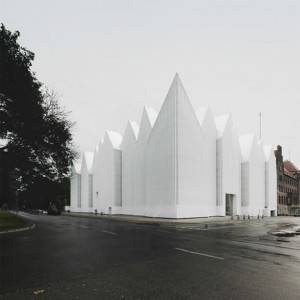
Szczecin Philharmonic Hall, Poland
Why does this language matter? Well, I think it lies in the tension between the desirability of making design accessible and the need for design to remain intellectually challenging and stimulating. Funding for the arts is under serious and persistent threat. That design is seen as elitist and impenetrable by many is undermining arguments that we should be increasing arts spending, not cutting it. We need more people on board if we can carry that argument authoritatively. Talking to people in language that they can more readily understand offers up the opportunity to broaden both its appeal and the debate about its future. It can help break the deadlock with a tiresome, entrenched Nimbyism. At a time when notable figures such as Stephen Hawking, Elon Musk and Bill Gates are starting to talk of the existential threats posed by artificial intelligence, design is a reminder of the beauty and creativity of human intelligence and its ability to benefit all of humankind.
____________________________________
 Simon Heath is a freelance illustrator and commentator on workplace and facilities management issues and was formerly Head of Operations, Global Workplace Strategies at CBRE. For more of Simon’s worldly, wise and witty writing on all things work and workplace, visit his blog https://workmusing.wordpress.com.





February 24, 2015
Design Museum Awards: the buildings may be accessible, but the language isn’t
by Simon Heath • Architecture, Comment, Workplace design
A building that could transform to take on the appearance of the people visiting it might be no bad thing if all people were as gorgeous as George Clooney. Unfortunately, some people, like me, are no oil painting and I’m not sure many people would want a building that looks as lumpy and misshapen as I am. And I’m simply not qualified to offer up any opinions on entries in the fashion category. I have underpants that are older than some of the designers.
UC Innovation Centre in Santiago
A great deal of the projects on this shortlist propose environments, products and technologies that show more than a cursory appreciation of the people that will interact with them. They feel accessible in a way that has been previously missing. What is retained though is the pompous, self-referential language that is such fruitful hunting ground for Private Eye’s Pseuds Corner. Buildings are described as being “anchored to the ground”, as opposed, one assumes, to all those other anti-gravitational buildings we’ve been struggling with. A gymnasium is designed with a “generous” roof, presumably offering a less thrifty roof than the ones we have now that don’t extend to all corners of the edifice and let all the rain and wind in. Designers have adopted “a strategy on the vertical dimension”, that is, it goes upwards. As far as I can tell, seating and storage “systems” are still chairs and cupboards. And then there’s this particular gem taken from the write up : “The hall is composed following a Fibonacci sequence whose fragmentation increases with the distance from the scene”. Translation: it looks like the skin of a pineapple.
Szczecin Philharmonic Hall, Poland
Why does this language matter? Well, I think it lies in the tension between the desirability of making design accessible and the need for design to remain intellectually challenging and stimulating. Funding for the arts is under serious and persistent threat. That design is seen as elitist and impenetrable by many is undermining arguments that we should be increasing arts spending, not cutting it. We need more people on board if we can carry that argument authoritatively. Talking to people in language that they can more readily understand offers up the opportunity to broaden both its appeal and the debate about its future. It can help break the deadlock with a tiresome, entrenched Nimbyism. At a time when notable figures such as Stephen Hawking, Elon Musk and Bill Gates are starting to talk of the existential threats posed by artificial intelligence, design is a reminder of the beauty and creativity of human intelligence and its ability to benefit all of humankind.
____________________________________