A great many of us pay architecture and design very little attention until it’s too late and we’re confronted with the workings of a mind that doesn’t consider whether just because we could really means we should. The kind of mind that designs a building that melts cars on the street or one with wind turbines that are so noisy they can’t be turned on. And so this week sees the announcement of nominees for the Design Museum Designs of The Year awards. It’s a studiedly eclectic list. In amongst the Lego calendars and texting fire alarms we also find a mobile gaming app designed to be used over many centuries (it is impossible to finish it in your lifetime, natch) that, it says here, “questions the inevitability of death, the meaning of legacy and the nature of progress”. I’ve searched for signs that this might be satire without success. However, we’ll focus our consideration on the nominations for designs for the built environment.
In the architecture section there are two notable designs that are thrown in to sharp relief by the others on the list. We’ll come back to those. It might just be a little unfair to the designers involved to form a critique from the blurb provided by the Design Museum but one has to assume they’ve taken the text from the submissions themselves.
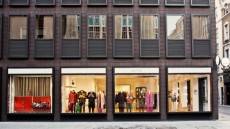
FAÇADE FOR PAUL SMITH, ALBEMARLE STREET, MAYFAIR, LONDON – Designed by 6a Architects is described as being “in sharp contrast to neighbouring Georgian townhouses”. Leaving aside for one moment the merits or otherwise of Georgian townhouses, it’s just this sort of sharp contrast that so infuriates the lay observer. Taken out of context, the “sinuous” cast iron design has much to commend it. But context is a serious consideration to those of us who have to live with the results. Sharp contrast might pander to designer sensibilities but a great many of us prefer empathetic design.
FRAC CENTRE – LES TURBULENCES, ORLÉANS – Designed by Jakob + MacFarlane. The building as landscape and topographic surface, designed to “reveal, provoke, stimulate and inform”? Revealing of the ego of the designer? Provoking thoughts of the mould used to produce porcelain sanitaryware? Stimulating the muscles of parkour enthusiasts? Informing us that we really don’t need thoughtfully conceived open public spaces?
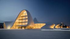
HEYDAR ALIYEV CENTER, BAKU, AZERBAIJAN – Designed by Zaha Hadid and Patrik Schumacher. Of all the myriad issues facing the people of Azerbaijan, architecture might seem the least contentious. However, the Heydar Aliyev Center is a building of rare beauty, deserving of its many plaudits and truly a gift to the people of this recently liberated country. Architect Magazine says that Hadid has faced accusations of formalism. I doubt the residents of Baku will have any such qualms.
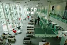 MONT DE MARSAN MEDIATHEQUE – Designed by archi5 “its transparent planes generously open to the view of the public” has dealt with its rather austere surroundings by imposing on the space a media library rather than taking advantage of its location near the France/Spain border and the pleasant climate that suggests to provide, for example, a landscaped, tree-filled park. The mention of generosity seems rather condescending in contrast.
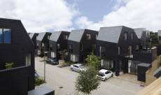 NEWHALL BE, HARLOW, ESSEX – Designed by Alison Brooks Architects “challenges the presupposition by housebuilders that we want very traditional looking houses”. With many people wondering how on earth they might afford any sort of house at all, anything that challenges any of the presuppositions of housebuilders is to be welcomed. If we might also challenge the policymakers with whom the housebuilders enjoy such a cosy relationship to do something about the over-inflated property market then this sort of scheme might become more commonplace.
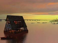
 I promised to come back to two designs of note in this category. They are MAKOKO FLOATING SCHOOL, NIGERIA (left) – Designed by NLÉ, Makoko Community Building Team and CHILD CHEMO HOUSE, KOBE (below) – Designed by Tezuka Architects, Takaharu & Yui Tezuka. They are, respectively, an innovative, cheap and sustainable floating school built for the historic water community of Makoko and accommodation where children undergoing chemotherapy treatment can live with their families.
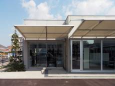 This is where contrasts really sharpen. I really have no idea of the amount of money spent on the other schemes listed in the nominations document. My uneducated guess is, A LOT. I’m certain that issues of community and sustainability were given careful consideration when the other entries were designed and that all of the buzzword boxes got a thorough ticking. But how might efforts and funds have been better put to work? I’m sure that Mont De Marsan really needed a media library. I’m equally sure that building schools in Nigeria is of vital importance. But why does a school need to be done cheaply and why does a media library need to be built at such expense. Because they can. So they did. When will we stop and think if we should?
(A caveat: I am not, nor have I ever been, an architect. No formal design qualification either. No degree. No formal training, unless you count my Cycling Proficiency Test. What qualifies me, as it does each and every one of us, is that I am a human being. I have a fully functioning brain. I am awake. I have lived in and around the built environment all of my life. That, I feel, is qualification enough.)
The Design of the Year exhibition runs until 25 August at the Design Museum, London. Details of the event can be found here.
__________________
 Simon Heath is a freelance illustrator and commentator on workplace and facilities management issues and was formerly Head of Operations, Global Workplace Strategies at CBRE. For more of Simon’s worldly, wise and witty writing on all things work and workplace, visit his blog https://workmusing.wordpress.com.







March 27, 2014
Design of the Year shortlist contrasts what is practical with what is possible
by Simon Heath • Architecture, Comment, Workplace design
A great many of us pay architecture and design very little attention until it’s too late and we’re confronted with the workings of a mind that doesn’t consider whether just because we could really means we should. The kind of mind that designs a building that melts cars on the street or one with wind turbines that are so noisy they can’t be turned on. And so this week sees the announcement of nominees for the Design Museum Designs of The Year awards. It’s a studiedly eclectic list. In amongst the Lego calendars and texting fire alarms we also find a mobile gaming app designed to be used over many centuries (it is impossible to finish it in your lifetime, natch) that, it says here, “questions the inevitability of death, the meaning of legacy and the nature of progress”. I’ve searched for signs that this might be satire without success. However, we’ll focus our consideration on the nominations for designs for the built environment.
In the architecture section there are two notable designs that are thrown in to sharp relief by the others on the list. We’ll come back to those. It might just be a little unfair to the designers involved to form a critique from the blurb provided by the Design Museum but one has to assume they’ve taken the text from the submissions themselves.
FAÇADE FOR PAUL SMITH, ALBEMARLE STREET, MAYFAIR, LONDON – Designed by 6a Architects is described as being “in sharp contrast to neighbouring Georgian townhouses”. Leaving aside for one moment the merits or otherwise of Georgian townhouses, it’s just this sort of sharp contrast that so infuriates the lay observer. Taken out of context, the “sinuous” cast iron design has much to commend it. But context is a serious consideration to those of us who have to live with the results. Sharp contrast might pander to designer sensibilities but a great many of us prefer empathetic design.
FRAC CENTRE – LES TURBULENCES, ORLÉANS – Designed by Jakob + MacFarlane. The building as landscape and topographic surface, designed to “reveal, provoke, stimulate and inform”? Revealing of the ego of the designer? Provoking thoughts of the mould used to produce porcelain sanitaryware? Stimulating the muscles of parkour enthusiasts? Informing us that we really don’t need thoughtfully conceived open public spaces?
HEYDAR ALIYEV CENTER, BAKU, AZERBAIJAN – Designed by Zaha Hadid and Patrik Schumacher. Of all the myriad issues facing the people of Azerbaijan, architecture might seem the least contentious. However, the Heydar Aliyev Center is a building of rare beauty, deserving of its many plaudits and truly a gift to the people of this recently liberated country. Architect Magazine says that Hadid has faced accusations of formalism. I doubt the residents of Baku will have any such qualms.
(A caveat: I am not, nor have I ever been, an architect. No formal design qualification either. No degree. No formal training, unless you count my Cycling Proficiency Test. What qualifies me, as it does each and every one of us, is that I am a human being. I have a fully functioning brain. I am awake. I have lived in and around the built environment all of my life. That, I feel, is qualification enough.)
The Design of the Year exhibition runs until 25 August at the Design Museum, London. Details of the event can be found here.
__________________