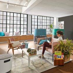
 Because a vast show like Clerkenwell Design Week is about as easy to digest as a whale omelette, visitors often find themselves discussing with other people what is worth seeing and, perhaps more importantly, what they think its themes are. At this year’s show, the fine weather meant it was possible for people to occupy the pavements with a drink and share a general feeling that in terms of workplace design, there were few, if any, standout products and that most of the themes were now pretty well understood.
There was a great deal of talk about the need for privacy, the creation of a choice of settings in which to work, the influence of the coworking movement, wellbeing, agile working, Millennials, the intersection of design idioms from the domestic and commercial worlds and planned serendipity. These are now familiar subjects and, with the exception of a largely false narrative about Millennials, all in tune with the main concerns of occupiers and employees. They may be familiar but we should celebrate the fact that this in itself signifies not only growing sophistication in the demands of buyers but also the way we address workplace issues as a sector. Most tellingly, there is one common factor at the heart of each of the concerns addressed in the designs on show; people.
This marks a profound shift from the old hierarchical constraints that used to define office design. The idea that a building should be carved up and shared out semi-permanently between individuals based on their job and status for set periods of time now looks more and more archaic as each day passes. The modern workplace can be pretty much anything it wants to be and we should not take that for granted just because it’s been said before.
Boss Design
Boss Design
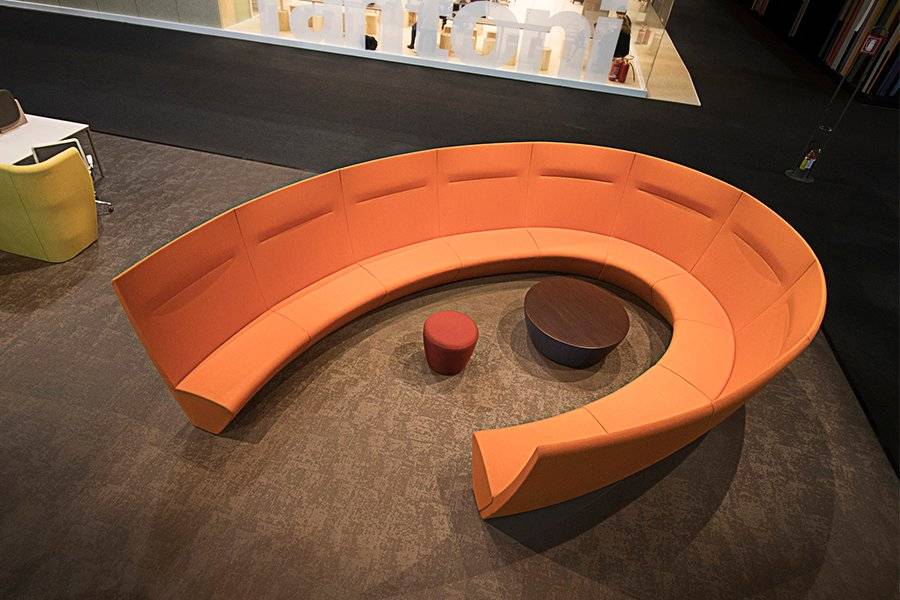
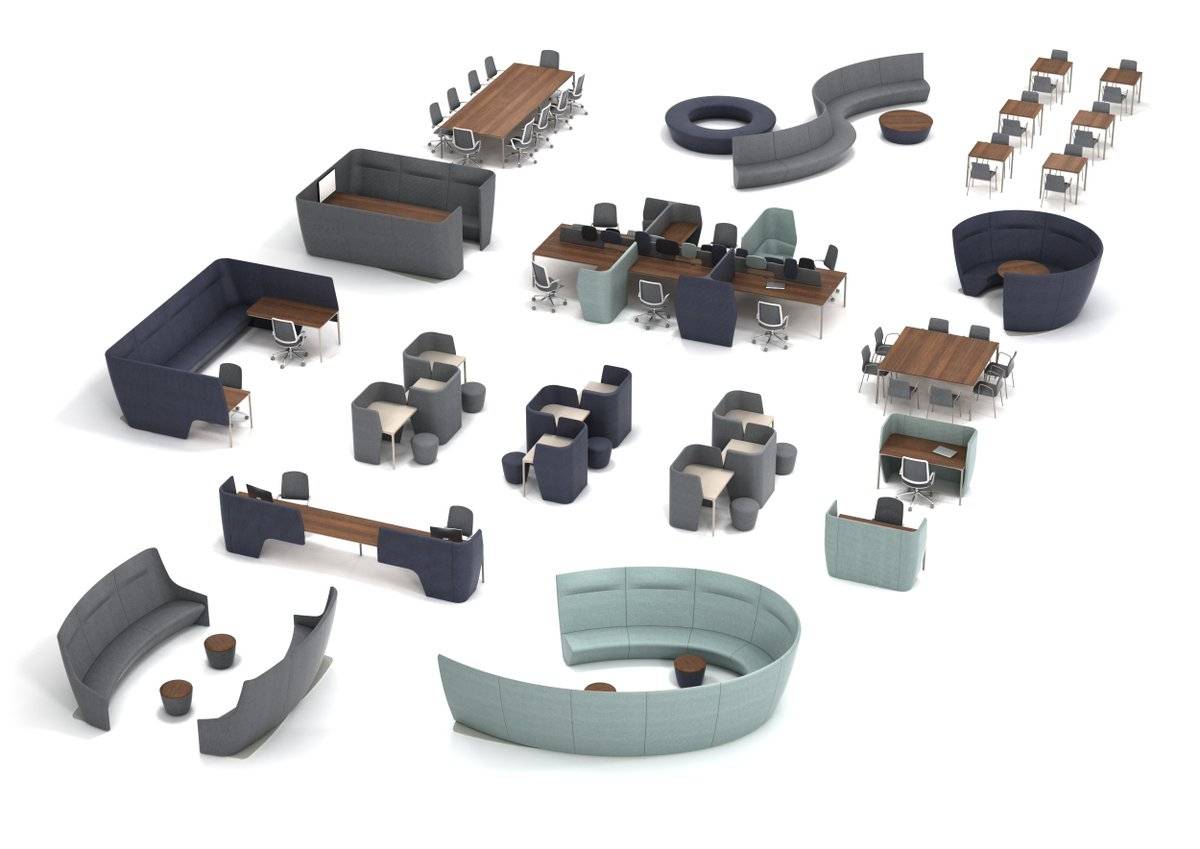
Encapsulating these ideas was a brand new range from Boss Design called Atom designed by Simon Pengelly. The business model of Boss has always meant it found itself at the intersection of various forms of design with a portfolio of products that could be used in a variety of settings, but Atom offers a fully resolved menu of elements that make the idea explicit.
Where once modularity in furniture design meant that parts fixed and tessellated, it now refers to a more freeform interpretation. This isn’t Lego modularity but something more organic, ingredients rather than parts.
The designs are very much focussed on people. These are the sorts of products that invite people to work in the ways that suit them best. Designers and office buyers are given the elements needed to offer employees choices but without any sense that solutions are prescriptive. As Simon Pengelly explained, it’s all very well having collaborative space but it only works if you’ve then got a space to do something with the ideas you’ve just shared. This was the best resolved system of products at the show and one very finely attuned to 21st Century office life.
Boss Design
Steelcase
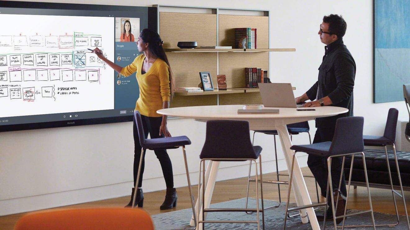
The world’s largest office furniture manufacturer was pursuing similar themes while also sharing the stage with Microsoft, a firm with which it has just announced a global partnership agreement, focussed in large part on the forthcoming Surface Hub, previews of which were available at the event. The main focus of the firms’ approach was how work settings can be integrated with technology to produce working environments that foster creativity. In the accompanying presentation, we were told not only that this will be the main focus of office design in the coming years as machines take on most of our process driven work, but also that if office furniture firms want to survive the century, they’ll need to be talking about far more than office furniture which is perfectly true and equally applies to the whole workplace sector. This is not a time for one trick ponies.
Appropriately Steelcase offered up a number of settings to give people the chance to work creatively including a Respite Room. Offices may exist to bring people together but we always need time away from them.
Steelcase (and top)
Connection
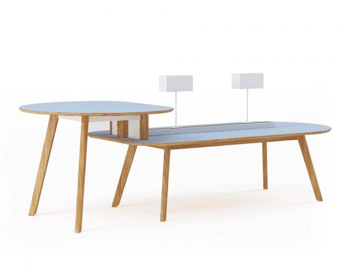
Connection was one firm that made the link between wellbeing and domestic and commercial design explicit with a soft seating system called Hygge. This is a reference to the modish Scandinavian practice of hygge, which cleverly taps into our ongoing fixation with all things Nordic and our belief that they have a unique insight into how to achieve a work life balance and look after themselves. The firm was also on point with its new co.table which again expresses the overlap between domestic and commercial design as well as the increasing adoption of agile working models. Connection was also addressing the issue of acoustics and privacy with its elegant system of rooms, now a well-established requirement for shared spaces.
Connection
Spacestor
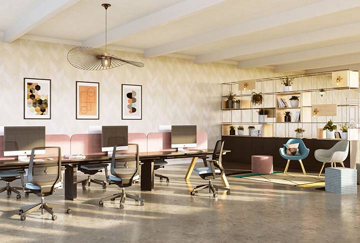
Another firm characterising the intersection of domestic and commercial design as well as the creation of room settings, Spacestor launched their new Palisades room divider system. Not screens but the sort of dividers used to break up space, as well as store and display objects. Spacestor were also showing their work pods, including options defined as railway carriage and phone booth.
Spacestor
Sit/stand workstations
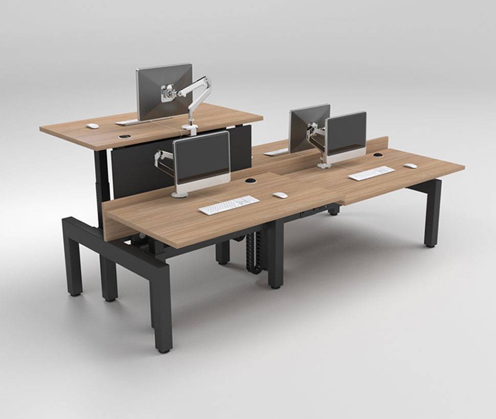
Now almost as ubiquitous as the bench desk, sit/stand workstations have become mainstream in the UK as they have been for quite some time in parts of Scandinavia. In part this is down to the medicalisation of sitting down as a result of some well thought out but – in my view – slightly off the point PR. But it is also a signifier that firms are interested in the wellbeing of their staff, an issue about which it is impossible to be cynical.
So Staverton, Humanscale and others had nice products on show, but it is evident that as is true with bench desks (and toilets, come to that), the product itself exists in pretty much its purest form as it is. It is a worksurface with an actuator to make it rise and fall. It’s a good product, but one which you can hardly expect to see evolve.
Staverton
Task seating
Conversely, the design of task chairs has actually returned to a simpler form. Over the past 20 or more years, there had been a race to see who could offer users the most adjustments. So, where once the chair merely went up and down and rocked, every part of it had to be adjustable in at least one dimension and preferably three. An arms race, if you will. The result was a proliferation of controls around and underneath the seat.
Over the past few years, we have seen a reversal of this in favour of something more intuitive. Typical of this new generation of chairs are the se:joy from Sedus, Trinetic from Boss Design, various designs from Humanscale (who, it could be said, catalysed the development of chairs that work with the body rather than an instruction manual) and, new this year, the EVA chair from Orangebox which claims that by ‘refining the chair to just a few controls has allowed us to focus on maximising the range of adjustment it offers’. Counter-intuitive maybe but they’re right.

Orangebox
Flooring
Innovation in carpet design tends to come about as a result of the interrelationship of new materials and manufacturing technology and the designs each manufacturer can derive from them. There are some great products on the market, and each one has a separate narrative woven around it, if you’ll forgive the pun. These can range from the use of colour and trends forecasting, to environmental concerns, the crafts movement, biophilia and printing techniques.
In typical fashion, the major flooring showrooms at Clerkenwell Design Week had lively events programmes that highlighted trends in the market and are perhaps somewhat less product focussed than furniture showrooms. So, Interface focussed on the positive effects that design can have on people, Milliken hosted a series of events including a Design in Education debate with Jay Osgerby and Annie Warburton and Shaw Contract hosted several CPD accredited talks including one rejoicing in the title “Using virtual reality as a participatory approach for evolving spaces in our cities”.

Porcelanosa
Socialising
And, of course an event like Clerkenwell Design Week would be nothing without the chance to have a drink and a chat with friends and colleagues. The event this year was blessed with blue skies and temperatures in the high twenties, which is a mixed blessing if you’re hosting parties at one of the showrooms. Despite concerns that the warm weather would mean people swapping bars for studios, all the events seemed incredibly well attended, including those at Vitra and KI.
This is, of course one of the main aims of such exhibitions, to bring an industry together as one and with one voice, at least this year with regard to the aims and concerns of workplace occupiers and the people who work for them. In all senses, an event about people.
_________________________________
Paul Goodchild is the Design Director of Fresh Workspace.







June 1, 2017
Settings and serendipity define workplace design at Clerkenwell Design Week 0
by Paul Goodchild • Comment, Workplace design
There was a great deal of talk about the need for privacy, the creation of a choice of settings in which to work, the influence of the coworking movement, wellbeing, agile working, Millennials, the intersection of design idioms from the domestic and commercial worlds and planned serendipity. These are now familiar subjects and, with the exception of a largely false narrative about Millennials, all in tune with the main concerns of occupiers and employees. They may be familiar but we should celebrate the fact that this in itself signifies not only growing sophistication in the demands of buyers but also the way we address workplace issues as a sector. Most tellingly, there is one common factor at the heart of each of the concerns addressed in the designs on show; people.
This marks a profound shift from the old hierarchical constraints that used to define office design. The idea that a building should be carved up and shared out semi-permanently between individuals based on their job and status for set periods of time now looks more and more archaic as each day passes. The modern workplace can be pretty much anything it wants to be and we should not take that for granted just because it’s been said before.
Boss Design
Boss Design
Encapsulating these ideas was a brand new range from Boss Design called Atom designed by Simon Pengelly. The business model of Boss has always meant it found itself at the intersection of various forms of design with a portfolio of products that could be used in a variety of settings, but Atom offers a fully resolved menu of elements that make the idea explicit.
Where once modularity in furniture design meant that parts fixed and tessellated, it now refers to a more freeform interpretation. This isn’t Lego modularity but something more organic, ingredients rather than parts.
The designs are very much focussed on people. These are the sorts of products that invite people to work in the ways that suit them best. Designers and office buyers are given the elements needed to offer employees choices but without any sense that solutions are prescriptive. As Simon Pengelly explained, it’s all very well having collaborative space but it only works if you’ve then got a space to do something with the ideas you’ve just shared. This was the best resolved system of products at the show and one very finely attuned to 21st Century office life.
Boss Design
Steelcase
The world’s largest office furniture manufacturer was pursuing similar themes while also sharing the stage with Microsoft, a firm with which it has just announced a global partnership agreement, focussed in large part on the forthcoming Surface Hub, previews of which were available at the event. The main focus of the firms’ approach was how work settings can be integrated with technology to produce working environments that foster creativity. In the accompanying presentation, we were told not only that this will be the main focus of office design in the coming years as machines take on most of our process driven work, but also that if office furniture firms want to survive the century, they’ll need to be talking about far more than office furniture which is perfectly true and equally applies to the whole workplace sector. This is not a time for one trick ponies.
Appropriately Steelcase offered up a number of settings to give people the chance to work creatively including a Respite Room. Offices may exist to bring people together but we always need time away from them.
Steelcase (and top)
Connection
Connection was one firm that made the link between wellbeing and domestic and commercial design explicit with a soft seating system called Hygge. This is a reference to the modish Scandinavian practice of hygge, which cleverly taps into our ongoing fixation with all things Nordic and our belief that they have a unique insight into how to achieve a work life balance and look after themselves. The firm was also on point with its new co.table which again expresses the overlap between domestic and commercial design as well as the increasing adoption of agile working models. Connection was also addressing the issue of acoustics and privacy with its elegant system of rooms, now a well-established requirement for shared spaces.
Connection
Spacestor
Another firm characterising the intersection of domestic and commercial design as well as the creation of room settings, Spacestor launched their new Palisades room divider system. Not screens but the sort of dividers used to break up space, as well as store and display objects. Spacestor were also showing their work pods, including options defined as railway carriage and phone booth.
Spacestor
Sit/stand workstations
Now almost as ubiquitous as the bench desk, sit/stand workstations have become mainstream in the UK as they have been for quite some time in parts of Scandinavia. In part this is down to the medicalisation of sitting down as a result of some well thought out but – in my view – slightly off the point PR. But it is also a signifier that firms are interested in the wellbeing of their staff, an issue about which it is impossible to be cynical.
So Staverton, Humanscale and others had nice products on show, but it is evident that as is true with bench desks (and toilets, come to that), the product itself exists in pretty much its purest form as it is. It is a worksurface with an actuator to make it rise and fall. It’s a good product, but one which you can hardly expect to see evolve.
Staverton
Task seating
Conversely, the design of task chairs has actually returned to a simpler form. Over the past 20 or more years, there had been a race to see who could offer users the most adjustments. So, where once the chair merely went up and down and rocked, every part of it had to be adjustable in at least one dimension and preferably three. An arms race, if you will. The result was a proliferation of controls around and underneath the seat.
Over the past few years, we have seen a reversal of this in favour of something more intuitive. Typical of this new generation of chairs are the se:joy from Sedus, Trinetic from Boss Design, various designs from Humanscale (who, it could be said, catalysed the development of chairs that work with the body rather than an instruction manual) and, new this year, the EVA chair from Orangebox which claims that by ‘refining the chair to just a few controls has allowed us to focus on maximising the range of adjustment it offers’. Counter-intuitive maybe but they’re right.
Orangebox
Flooring
Innovation in carpet design tends to come about as a result of the interrelationship of new materials and manufacturing technology and the designs each manufacturer can derive from them. There are some great products on the market, and each one has a separate narrative woven around it, if you’ll forgive the pun. These can range from the use of colour and trends forecasting, to environmental concerns, the crafts movement, biophilia and printing techniques.
In typical fashion, the major flooring showrooms at Clerkenwell Design Week had lively events programmes that highlighted trends in the market and are perhaps somewhat less product focussed than furniture showrooms. So, Interface focussed on the positive effects that design can have on people, Milliken hosted a series of events including a Design in Education debate with Jay Osgerby and Annie Warburton and Shaw Contract hosted several CPD accredited talks including one rejoicing in the title “Using virtual reality as a participatory approach for evolving spaces in our cities”.
Porcelanosa
Socialising
And, of course an event like Clerkenwell Design Week would be nothing without the chance to have a drink and a chat with friends and colleagues. The event this year was blessed with blue skies and temperatures in the high twenties, which is a mixed blessing if you’re hosting parties at one of the showrooms. Despite concerns that the warm weather would mean people swapping bars for studios, all the events seemed incredibly well attended, including those at Vitra and KI.
This is, of course one of the main aims of such exhibitions, to bring an industry together as one and with one voice, at least this year with regard to the aims and concerns of workplace occupiers and the people who work for them. In all senses, an event about people.
_________________________________
Paul Goodchild is the Design Director of Fresh Workspace.