September 19, 2014
Sound, settings, serendipity and other lessons from 100% Design
The trick with visits to exhibitions like 100% Design is to stay focussed on the wood as much as the trees. So as well as identifying the good, the bad and the meh, it pays to discern the themes pursued by the exhibitors and organisers. Leaving aside what was happening in the domestic halls, those related to the workplace invariably derive from a mixture of what the exhibitors’ customers are talking to them about and what the media says people are talking about. So at this year’s show (still ongoing till tomorrow at Earl’s Court) some of the most readily identifiable themes included the dissipation of the workplace, privacy, ergonomics and serendipity. With the possible exception of the age old problem of ergonomics, these all relate to our changing relationship with work and workplaces, not least how we can – and indeed must – be able to work from anywhere and what this means both functionally and aesthetically.
In many ways, 100% Design is better able to convey this idea than other shows precisely because it already straddles the worlds of home, hospitality, public space and office. Indeed firms like Vitra could happily inhabit any of three of the main halls (Workplace, Eco Design and Build, Interiors). Although we might ponder why they choose never to occupy the Workplace hall itself beyond installing some meeting booths in one of the shared areas.
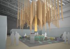
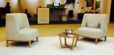
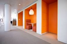
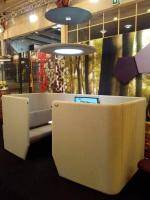
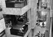
Even without the mighty presence of Vitra this crossover was very evident in the Workplace hall. At the heart of the space and exemplifying the theme was the Workplace Hub (top), designed by NBBJ architects. ‘The Workplace hub’, ran the show blurb, ‘aims to highlight the multidisciplinary nature of the workplace, as well as the social importance of the modern office environment. The feature will reflect the fusing of hospitality and working environments, an emerging trend that is increasingly informing workplace design. The hub will offer a true networking and social space during the show, inspired by the theme of serendipity.’
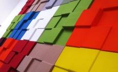
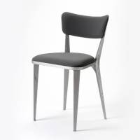
This fusion of the roles and looks of the workplace and other types of space was evident on the stands of exhibitors. Perhaps foremost amongst these was Buzzispace, a young company that has nevertheless grown rapidly and redefined what we understand about office acoustics, not least how they can be addressed by things more interesting than sticking upholstered rectangular panels between desks. The founder of the company Steve Symons is clearly not a man to rest on these particular laurels and the company has extended its focus to cover the blurring of the lines between office and elsewhere, for example with the provision of a bench product and resurrecting Ernest Race’s classic BA3 chair from the 1940s in an office/ wherever context.
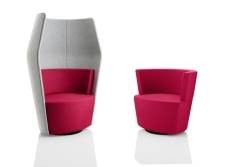
Another company that has successfully explored the intersections between the places we work is Boss Design, who once again capitalised on their prominent position with a showcase for the flagship products they launched at last year’s show including the Soft Office collection as well as new products Peek and Boo (geddit?) that address the same market. Next door, Lyndon Design (part of the Boss Group) had their own take on the overlap with the launch of a new system designed by Mark Gabbertas called Maya.
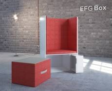
One show debutant that covered similar ground was the Swedish EFG who featured a range of products aimed similarly at a marketplace defined by peripatetic individuals with a hankering for some privacy and quiet.
Other firms addressed related concerns for the same group of people. Euroworkspace offered up its Simplicity locker system which it claims offers ‘hot lockering’ for mobile workers.
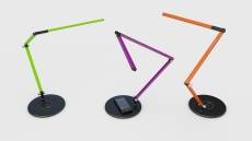
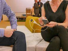
Others considered the technological needs of mobile workers, not least the charging of their equipment. Aircharge showcased their wireless charging plate which can fitted to other products such as lamps and worksurfaces, while OE Electrics launched POSE to do the same job but aimed at soft seating areas.
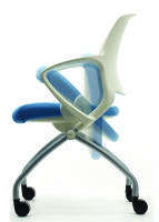
The idea of mobility is also now central to the way ergonomics is presented, especially with regard to task seating. The days when the most progressive of these companies would talk of posture are gone. Now we have to move and not just sit in the approved way so chair designs must accommodate the flexing of heads, shoulders, knees and toes.
Away from the Workplace hall and into the Eco Design and Build hall, and a reminder that it’s easy to be cynical about the ethical claims of firms, so I’m not about to resist it now. The problem here is the same as it is at the Ecobuild exhibition and others. No company claims to be anything other than environmentally friendly, so the problem when they gather together under the ‘Eco’ banner as well as when they bid for work is not greenwash but white noise. If everybody is making similar or identical claims, what is the point of making them except to fit in and tick a box?
Doubtless the claims many of these firms make reward closer inspection but I’m not about to do that and nor are the show’s organisers so it’s all meaningless. Unless the people who stage this part of the show actually set stringent criteria for what they mean by ‘Eco’ and exclude firms on the basis of them, they should just rename the whole thing ‘Design and Build’ so everybody knows where they stand. Maybe at some level, the organisers have already conceded this point because the message of the press material about this part of the show is virtually indistinguishable from that of the rest. The ‘Eco’ is superfluous.
And, on a final grumpy note, I’d like the organisers to enforce a strict ban on the use of the words ‘form’ and ‘function’ in the same sentence of exhibitor’s marketing material unless used ironically or in some way other than as an uncreative way of expressing creativity.

