November 24, 2017
White Paper: intuitive design and the changing face of workplace interactions
In his famous 1988 book The Design of Everyday Things, the cognitive scientist Donald Norman suggests that the way we interact with objects and our surroundings is determined almost entirely by their design. People cannot be the primary reason things succeed or fail, because they are constant, while the design of the object itself is the variable. People can expect to learn how to use things better, but without an underlying people-centric and intuitive approach to design, the design will fail to some degree or other. He concludes that the designer should focus their attention on the interaction between people and the design of objects and surroundings. This principle becomes more relevant with each passing day, as the number of interactions we have with designed objects increases. This is most obvious with regard to our interactions with technology, but it is also apparent across our entire lives.
There can be no better or more contemporary than the example of Uber, for all their recent troubles. The technology behind the app is not seen as new or ground-breaking. What has allowed Uber to go from start-up to global prominence in the space of just nine years is the fact that it makes things easy for the user. Its strength is not its technology, but its design. The ability to order a car with a few taps of a smartphone screen transformed an entire sector worldwide.
This may be more apparent in the modern world, but the underlying principle has been understood for a long time. As long as half a century ago the designer Dieter Rams set out his famous Ten Principles of Good Design, which include the demands that good design makes a product useful, innovative, honest and understandable.
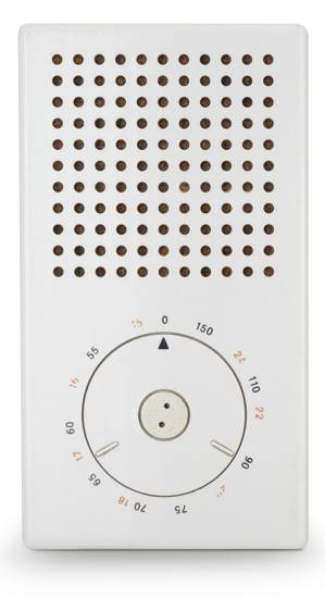 His influence is felt to this day, not least in the work of Sir Jonathan Ive with Apple. There is a minor Internet meme based on comparisons between Rams’ work for Braun and Ive’s own products for Apple, which are now regarded as exemplars of intuitive design thinking. Perhaps the best known example is the T3 Pocket Radio from 1958, which has a minimal design and circular tuner that became synonymous with the innovative, intuitive design of the iPod in the early years of this Century. Both products reflect the gestures and instincts common to all of us, which is why their design resonates across the years.
What has changed in the interim is an increased expectation that we should find our interactions with design to be immediate and coherent. This expectation has now extended to our surroundings as well as discreet objects and technology. We have neither the time nor inclination to learn how to use something, when a better design would make it immediately obvious.
In terms of workplace design, the greater use of shared and public space means this not only includes the design of specific items of furniture but also the overall design of the workplace. If we want people to move to the space best suited to their needs, then the workplace must make the purpose and functioning of its elements obvious to them. In other words, it must behave more like one of their favourite devices, and its individual spaces more like an app.
This white paper explores these ideas and their application at work and the challenges they set for designers and managers. We hope you enjoy it.
_______________________________
Oliver Ronald is Sales and Marketing Director at Boss Design Group


