 Conference and show season looms and with it arrives the annual swarm of workplace trend forecasts. These are often presented as groundbreaking but many of them are indistinguishable from each other and based on some very familiar tropes and assumptions. These days such things tend to be shaped into lists, because that’s how the Internet likes it. That is all perfectly natural and we are free to make our own mind up which of these features are meaningful and which are hack jobs. No football pundit was ever fired for stringing together clichés rather than thinking and talking, and no marketing person has ever lost their job for publishing a list of Ten Trends.
One thing all of these lists seem to share is an assumption that many of the ideas they reflect are new. That’s understandable. Nobody wants to think that what they consider to be on trend has all been seen before.
So it is for many of the office design trends that underpin these features. Twenty and more years ago, office design really was undergoing a complete rethink and much of this was captured in a series of books that attempted to make sense of what was unfolding. One of the best of these was undoubtedly Frank Duffy’s The New Office which is replete with ideas and language that could be transposed into 2018 with almost no trouble at all.
The reason the book works so well is firstly that Duffy understood that the major tension that drives changes in the way we design offices is that which exists between the building, human beings and technology. The second reason is that he provides a snapshot of how this tension is being resolved with case studies, rather than theorising. Firms often find themselves unknowingly innovating in the way they use their offices because they are addressing the tensions that exist in their business in a purely practical way.
Of course, the major change in the relationship between the three key elements that make up a workplace when Duffy was writing was technological. The mid 1990s was the point at which the world was tipping from analogue to digital, from fixed to mobile and this is clearly reflected in the examples used in the book.
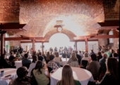
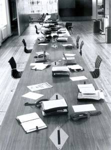 What is intriguing is just how many of the underlying ideas would still now be presented as a ‘trend’. So here we have Chiat Day’s vivid and playful New York offices from 1994 designed by Gaetano Pesce, the progenitor of all those TMT creative offices that clog up those Cool Offices lists (and also a lesson in what can go wrong). Here we have a firm called Michaelides and Bednash working around a single shared long table (right) that clearly announced the arrival of the bench desk that was to become the de facto default desk solution in the years that followed.
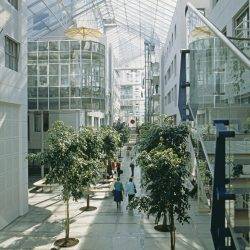
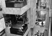
Here too is the urbanisation of space and the creation of work campuses evident in the work of Niels Torp for SAS in Stockholm (main image) and British Airways at the Waterside Building near London. We have informality and collaborative working at Sun Micro in California and Digital Equipment in Sweden. We even have an early form of coworking in the form of the a warehouse in California in which a group of young designers came together to share space in a converted derelict warehouse.
These ideas remain constant and universal because, for all the change driven by technology, there is always one element of the workplace that remains largely unchanged and that is the people inside it. They are the reason why our forecasts of trends don’t differ as much from year to year as we may suppose.
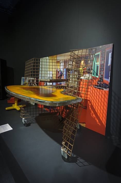 This goes both for the people who occupy buildings and those who make decisions about their design. For some, such as Michaelides and Bednash, there are practical considerations such as making the most of a specific space and the creation of a collaborative shared working environment. For Chiat Day, the thinking was about the imposition of a working culture and the rejection of a corporate aesthetic, hence why the desks (right) look more crafted than manufactured.
I expect this same desire to at least look as if you’re not working for The Man will again be evident at the upcoming exhibitions such as 100% Design and Orgatec.
The underlying thinking about what makes people happy and productive and the firm look ‘cool’ remains largely unchanged and is often based on a straightforward rejection of drab corporate life. What we should have learned by now, and haven’t for the most part, is that it is possible to seek a different path to the lowest common denominators of office design, without resorting to faddism. The best informed commentators of the 1990s knew it at the time and their message still resonates today.






September 14, 2018
All those workplace trends lists that you see? We’ve been there before 0
by Mark Eltringham • Comment, Facilities management, Furniture, Workplace design
One thing all of these lists seem to share is an assumption that many of the ideas they reflect are new. That’s understandable. Nobody wants to think that what they consider to be on trend has all been seen before.
So it is for many of the office design trends that underpin these features. Twenty and more years ago, office design really was undergoing a complete rethink and much of this was captured in a series of books that attempted to make sense of what was unfolding. One of the best of these was undoubtedly Frank Duffy’s The New Office which is replete with ideas and language that could be transposed into 2018 with almost no trouble at all.
The reason the book works so well is firstly that Duffy understood that the major tension that drives changes in the way we design offices is that which exists between the building, human beings and technology. The second reason is that he provides a snapshot of how this tension is being resolved with case studies, rather than theorising. Firms often find themselves unknowingly innovating in the way they use their offices because they are addressing the tensions that exist in their business in a purely practical way.
Of course, the major change in the relationship between the three key elements that make up a workplace when Duffy was writing was technological. The mid 1990s was the point at which the world was tipping from analogue to digital, from fixed to mobile and this is clearly reflected in the examples used in the book.
Here too is the urbanisation of space and the creation of work campuses evident in the work of Niels Torp for SAS in Stockholm (main image) and British Airways at the Waterside Building near London. We have informality and collaborative working at Sun Micro in California and Digital Equipment in Sweden. We even have an early form of coworking in the form of the a warehouse in California in which a group of young designers came together to share space in a converted derelict warehouse.
These ideas remain constant and universal because, for all the change driven by technology, there is always one element of the workplace that remains largely unchanged and that is the people inside it. They are the reason why our forecasts of trends don’t differ as much from year to year as we may suppose.
I expect this same desire to at least look as if you’re not working for The Man will again be evident at the upcoming exhibitions such as 100% Design and Orgatec.
The underlying thinking about what makes people happy and productive and the firm look ‘cool’ remains largely unchanged and is often based on a straightforward rejection of drab corporate life. What we should have learned by now, and haven’t for the most part, is that it is possible to seek a different path to the lowest common denominators of office design, without resorting to faddism. The best informed commentators of the 1990s knew it at the time and their message still resonates today.