October 25, 2013
The Great Gatsby and the rehabilitation of the office cubicle
 The finest closing sentence of any novel in my opinion is that in The Great Gatsby. “So we beat on, boats against the current, borne back ceaselessly into the past.” It is a reference to the futility of our attempts to escape the past, even as we look to the future, dreaming of how “tomorrow we will run faster, stretch out our arms farther”. F Scott Fitzgerald was referring to people when he wrote it, and Jay Gatsby in particular, but it’s a passage that resonates in a number of ways, especially in those areas of our lives that deal most intimately with what it means to be human. And one of these is self-evidently the workplace, where any articular attempt to define the ideal office for a particular time, including the future, is complicated by the fact that we must always meet the needs of the beasts that inhabit it. Regardless of the tools we have at our disposal with which to work more effectively, or just plain ‘more’ we remain fundamentally the same animals we were thousands of years ago.
Or even forty-something years ago. I recently dug out my copy of Herman Miller designer Bob Propst’s manifesto called A Facility Based On Change. The book lays out the thinking behind the launch of Action Office in 1968. What is interesting about Propst’s book is how relevant its language and ideas are to the way we work now. There are sections dealing with striking the right balance between privacy and collaboration, managing change, the focus on individual performance and the need to express identity through office design. The inescapable conclusion of the book is that the design of office furniture is a reflection of the social, commercial, technological, economic and cultural forces that shape the workplace, but especially the animal at the centre of them all.
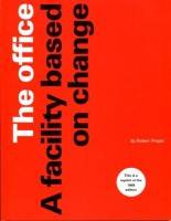 The trigger for me to re-explore the book’s contents was the unmistakeable signs at 100% Design that the most demonised symbol of corporate alienation – the cubicle – is back on the scene. One of the principle drivers for this rehabilitation is of course the need for acoustic and visual privacy. The relative importance of these two factors had appeared to lapse recently as we accepted that the open plan was the way to go to encourage collaboration, the exchange of ideas and, of course, cutting costs. This all went hand in hand with the domination – of the UK market at least – by bench desking.
For all that, the problem of privacy for people was never going to go away and the solution in a was shifted away from the personal workstation and on to what we now refer to as ‘third space’ – breakout areas, bookable cells and more recently acoustic pods.
There were plenty of these third space products on show at 100% Design, but there were also more signs of a shift back to providing acoustic and visual privacy at the first space – the desk. This was most evident in the display from KI, a US owned company, the spiritual home of the cubicle and a country still not quite as familiar with a long-established open plan hegemony as we are in Western Europe.
Old school
Yet their new integrated system UniteSE, while looking unmistakably like an old school North American modular panel system from the Action Office mould is in fact designed by London based Welsh designer Craig Jones, is manufactured in Yorkshire and Essex and works in very contemporary ways to address the UK market. This includes the integration of third spaces into a modular layout and a screen system specifically designed to provide acoustic and visual privacy. The upshot is unmistakeably a cubicle, albeit one that could only work now.
The same approach to creating a new generation of cubicles was also evident in the presentation by Icon of their new range, System 06, which can function as a freestanding screen but is also presented as an unashamedly modern response to the growing demand from customers to create more private places for staff to work and if, from a practical point of view that means cubicles, then so be it.
This may all come as news in the US where it’s still possible to read features about the ways in which the cubicle is dying out. Indeed an August report from Corenet Global claimed that the main reason for a reported fall in the average space per worker globally from 225 sq. ft. to 150 sq. ft was that more than 80 percent of the respondents said their company had reduced the numbers of cubicles they used. It’s worth putting this in context by noting that just as the ‘World Series’ in baseball really means The ‘US Series’, the CoreNet survey is skewed towards the American experience.
On this side of the pond, where Dilbert dated very quickly, we are now rediscovering the joys, practicalities and compromises of the cubicle for a second time. While it is the comparative immutability of the human animal with its desires and needs that is bearing us back to this part of our past, this time around things will be slightly different as designers take account of the forces that have driven the evolution of the workplace over recent years.
This feature first appeared in the October issue of Mix Interiors magazine.
Mark is the publisher of Workplace Insight, IN magazine, Works magazine and is the European Director of Work&Place journal. He has worked in the office design and management sector for over thirty years as a journalist, marketing professional, editor and consultant.









A four hundred year old guide to ergonomics still rings true
November 11, 2013 @ 6:31 am
[…] that whatever we do, something like it will have been done before. That goes for products like the office cubicle as well as principles such as ergonomics. The term ergonomic may have been coined as recently as […]