 One important concept the pandemic has taught us is that irrespective of where we work and whatever form the future workplace takes, our brand must remain strong. With much of our workforce now working from home, how do we bridge the gap between corporate and home life? As head offices re-form into social hangout hubs, and dining tables become makeshift desks, one message is loud and clear – connection with and delight in a brand is everything. From our internal talent and culture, and supply partnerships, to external customer persona, we must strengthen our culture both inside and out.
The half-eaten breakfast meetings, the post-sofa lunch meetings, the hurried pre-school run meetings, there’s no denying our homes and workplaces are now irrevocably intertwined. From designing for top retail and hospitality names for over 12 years, I’ve discovered design principles relevant to the workplace that workplace managers can apply now to promote wellbeing and retain talent – the lifeblood of our brands.
We fall in love with brands when we feel like we have connected with them, which in retail can be as simple as a personalised gift wrap, a warm welcome as you enter or a complimentary chocolate tasting surprise. Our workspace should mimic a similar human touch. Embrace your community, whether it be colleagues or visitors, so that they feel they have stepped into the brand’s playground, from the scent of the space when the lifts open, all the way through to the materials that they touch. A space should be recognisable to the brand even when the branding on the wall cannot be seen which is what we always design to. Design a space where the user would know where they are without seeing it scribed on the wall.
Office spaces
The design of your brand’s workspace is an opportunity to adhere to your own company principles. For example, if you are a company that supplies eco products, you could reflect this throughout your space by using recycled and sustainable materials which users can connect with. This strengthens the authenticity of the brand and showcases that the brand message passes all the way through the business and doesn’t just stop at the product.
Creating concepts for brands such as Watches of Switzerland, Topshop and Pizza Express have helped to develop my sense of concept design. Each of their restaurants is different and reflects the local environment and the history of the building. We’d research the local area, and the history of the site and the design, architecture, artwork, furniture, lighting and even the music playing in the restaurant would reflect that individual story. That’s how workplaces should be designed.
Keeping consistency from your brand’s 2D marketing material through to its 3D physical space is critical to strengthen your brand’s appearance and attract new talent. A recruit may have been following an exciting brand on Instagram and fallen in love with the imagery that has connected them with the brand, so the day they arrive in your space you want them to feel the same excitement. A grey space filled with generic furniture with no reasoning behind it shows little attempt at creating an engaging space which ultimately could change someone’s perception of your brand and what you offer. Your staff want to work in a space they feel proud of. Happier staff mean higher retention rates, increased productivity and a better understanding of your organisation’s mission, vision and values.
At home
‘Home is where the heart is’, right? But now many of our employees are flying the corporate flag solo in the most personal way – in their home space. There are two design challenges workplace managers can tackle here – customer perception and talent retention.
As the customer, Zoom meetings from spare bedrooms and calls with patchy phone reception are tolerated at this time, but there are some simple, budget-friendly enhancements that can be made to sharpen brand image from any location or setup. At its most basic level, companies can provide every employee with a branding package that includes corporate backgrounds for devices and online meetings.
Some forward-thinking organisations are now sharing their design budgets between the office and home workspaces. From the simplest desk and chair set up, to branded pop-up screens and company merchandise, there are many simple ways to portray the professionalism of a brand and make employees feel part of the culture. Some businesses have adopted this concept further and designed and fitted out home offices for senior staff to emanate the brand they represent.
In a nutshell, your workspace is your ‘shop window’, your ‘landing page’. It should connect instantly with you and welcome you with an enormous brand jacket upon arrival making sure you feel the space, you see it and emotionally you connect with it.
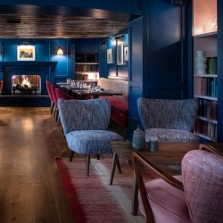
Image: Quadrant Design










February 11, 2021
The future workplace will only thrive with social and customer experience at its heart
by Sonia Brown • Comment, Workplace design
The half-eaten breakfast meetings, the post-sofa lunch meetings, the hurried pre-school run meetings, there’s no denying our homes and workplaces are now irrevocably intertwined. From designing for top retail and hospitality names for over 12 years, I’ve discovered design principles relevant to the workplace that workplace managers can apply now to promote wellbeing and retain talent – the lifeblood of our brands.
We fall in love with brands when we feel like we have connected with them, which in retail can be as simple as a personalised gift wrap, a warm welcome as you enter or a complimentary chocolate tasting surprise. Our workspace should mimic a similar human touch. Embrace your community, whether it be colleagues or visitors, so that they feel they have stepped into the brand’s playground, from the scent of the space when the lifts open, all the way through to the materials that they touch. A space should be recognisable to the brand even when the branding on the wall cannot be seen which is what we always design to. Design a space where the user would know where they are without seeing it scribed on the wall.
Office spaces
The design of your brand’s workspace is an opportunity to adhere to your own company principles. For example, if you are a company that supplies eco products, you could reflect this throughout your space by using recycled and sustainable materials which users can connect with. This strengthens the authenticity of the brand and showcases that the brand message passes all the way through the business and doesn’t just stop at the product.
Creating concepts for brands such as Watches of Switzerland, Topshop and Pizza Express have helped to develop my sense of concept design. Each of their restaurants is different and reflects the local environment and the history of the building. We’d research the local area, and the history of the site and the design, architecture, artwork, furniture, lighting and even the music playing in the restaurant would reflect that individual story. That’s how workplaces should be designed.
Keeping consistency from your brand’s 2D marketing material through to its 3D physical space is critical to strengthen your brand’s appearance and attract new talent. A recruit may have been following an exciting brand on Instagram and fallen in love with the imagery that has connected them with the brand, so the day they arrive in your space you want them to feel the same excitement. A grey space filled with generic furniture with no reasoning behind it shows little attempt at creating an engaging space which ultimately could change someone’s perception of your brand and what you offer. Your staff want to work in a space they feel proud of. Happier staff mean higher retention rates, increased productivity and a better understanding of your organisation’s mission, vision and values.
At home
‘Home is where the heart is’, right? But now many of our employees are flying the corporate flag solo in the most personal way – in their home space. There are two design challenges workplace managers can tackle here – customer perception and talent retention.
As the customer, Zoom meetings from spare bedrooms and calls with patchy phone reception are tolerated at this time, but there are some simple, budget-friendly enhancements that can be made to sharpen brand image from any location or setup. At its most basic level, companies can provide every employee with a branding package that includes corporate backgrounds for devices and online meetings.
Some forward-thinking organisations are now sharing their design budgets between the office and home workspaces. From the simplest desk and chair set up, to branded pop-up screens and company merchandise, there are many simple ways to portray the professionalism of a brand and make employees feel part of the culture. Some businesses have adopted this concept further and designed and fitted out home offices for senior staff to emanate the brand they represent.
In a nutshell, your workspace is your ‘shop window’, your ‘landing page’. It should connect instantly with you and welcome you with an enormous brand jacket upon arrival making sure you feel the space, you see it and emotionally you connect with it.
Image: Quadrant Design
Sonia Brown is director and head of design at Quadrant Design