 World-of-work watchers will be more than aware that we are increasingly being informed that we are living in the VUCA age, which under normal circumstances is an acronym for volatile, uncertain, complex and ambiguous but in the context of these RIBA Award Winners for 2014 might be taken in a number of other ways. Commentators and self-styled thought leaders are warning businesses to prepare for seismic changes to the way work gets done, where, how and by whom (or by what, if proponents of automation and robotics have anything to do with it). How lovely then, that RIBA have made awards to seven offices that hark back to more comforting, more halcyon, times. The text of the accompanying feature in Architects Journal is at pains to point out that offices are hard to design and that RIBA awards are hard won. I wouldn’t disagree on the former point but, from the evidence on show, it’s a bit more of a challenge to agree with the later. So I won’t.
The AJ article announcing the winners seems a little conflicted itself, posing the question: “With so much raw material available, why aren’t more architects engaged with the translation of exterior to interior?” And then helpfully goes on to posit an answer: “Perhaps the answer lies in the lack of information about how [offices] work in practice, as there is little incentive to get involved.” This must be particularly galling for specifiers and potential occupiers alike. Little incentive to get involved? How’s that? Little incentive to design human-centred workplaces for the future? Judging by the contract values on show (where immodesty has allowed) there’s certainly a financial incentive. Does the fault the lie with the specifiers? Surely they must be aware of the need of occupiers. Or does the blame lie with occupiers? Can the acres of coverage given over to the fad-heavy offices of Google fallen on unenlightened ears?
So, what then of the award winning offices themselves?
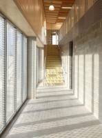 Manor Works (left) is a community enterprise centre, which “eschews the usual tropes of community architecture – ‘jolly colour’ and ‘whizz-bang’ formal gestures”. From the available photograph it has succeeded admirably. Bare wood, blinds and breeze blocks give it the feel of, well, a community enterprise centre, with all that the name suggests. I can’t quite get to grips with the formality of whizz-bang and jolly but I can imagine that potential users would have preferred them over bland and insipid.
Architecture Archive (right) is described in the AJ as “a kind of indulgent garden shed”, which seems a 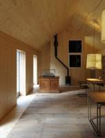 little unkind given that it is designed to house the client’s collection of historic and contemporary architectural drawings. It is an attractive space. I’d like something similar myself.
 Up next is the erection every urban nimby loves to hate, The Shard (no introduction needed) less well known as London Bridge Tower. As of February 2014 The Shard’s total office space occupancy to stood at 30 per cent. According to the Financial Times. developer Irvine Sellar said he aimed to let the rest of the space by the end of this year having deliberately avoided letting a large amount of space to any one company, aiming instead to create a “community”, he said. “I wanted it to be multi-let, a vertical town.” It’s a town with a few fundamental issues. The Shangri-La Hotel has been forced to warn guests to shut the blinds in their rooms when it gets dark after it became apparent that glass panels protruding from the building’s corners turned highly reflective when the internal lights were switched on, allowing them to see into other guest’s rooms. The award
  citation notes that the building touches the ground effortlessly which is to be admired when you consider all of those other high rise building casually crumpling into their foundations like an indolent teenager waiting for a bus.
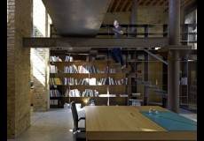
115 Golden Lane (right) seems to have won been awarded purely on the basis of removing previous, presumably non-award winning, architectural mistakes.
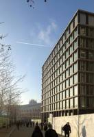 One Pancras Square (left) is key in the King’s Cross masterplan. The brief was for a “speculative office building” and the result, described as “understated and elegant” evokes those two words in the same way that a stack of shipping containers might. It has textured cast iron columns that are “somehow otherworldly”, one assumes another world in which occupiers are clamouring for buildings that look like they were designed by a distracted five-year old from Lego with one eye on Peppa Pig.
Porthmeor Artists’ Studios and Fishermens’ Cellars (right) looks beautiful and on pure design terms 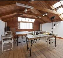 might very well merit its award. Its inclusion here merely serves as a jarring juxtaposition with the lack of love that evidently goes in to much commercial office design.
Buchanan Gate Stepps (below) is Scottish Water’s national operations centre. It looks like one.
Whilst one must acknowledge that RIBA makes awards for architects, these processes do serve to highlight the ongoing disconnect between the human users of office space and the people who 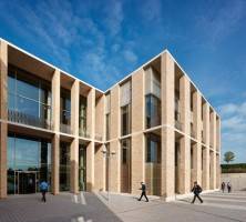 design them. Workplace strategists are custodians of a deep and holistic understanding of what works for people at work. Specifying and project managing the creation of a truly effective work space that allows employees to be at their very best, be it in terms of productivity, creativity or innovation is where real plaudits should lie.
______________________________________
 Simon Heath is a freelance illustrator and commentator on workplace and facilities management issues and was formerly Head of Operations, Global Workplace Strategies at CBRE. For more of Simon’s worldly, wise and witty writing on all things work and workplace, visit his blog https://workmusing.wordpress.com.




June 19, 2014
Virtually Uninspiring, Cautiously Aspirational – award winning offices for the VUCA world.
by Simon Heath • Architecture, Comment, Workplace design
The AJ article announcing the winners seems a little conflicted itself, posing the question: “With so much raw material available, why aren’t more architects engaged with the translation of exterior to interior?” And then helpfully goes on to posit an answer: “Perhaps the answer lies in the lack of information about how [offices] work in practice, as there is little incentive to get involved.” This must be particularly galling for specifiers and potential occupiers alike. Little incentive to get involved? How’s that? Little incentive to design human-centred workplaces for the future? Judging by the contract values on show (where immodesty has allowed) there’s certainly a financial incentive. Does the fault the lie with the specifiers? Surely they must be aware of the need of occupiers. Or does the blame lie with occupiers? Can the acres of coverage given over to the fad-heavy offices of Google fallen on unenlightened ears?
So, what then of the award winning offices themselves?
Architecture Archive (right) is described in the AJ as “a kind of indulgent garden shed”, which seems a little unkind given that it is designed to house the client’s collection of historic and contemporary architectural drawings. It is an attractive space. I’d like something similar myself.
115 Golden Lane (right) seems to have won been awarded purely on the basis of removing previous, presumably non-award winning, architectural mistakes.
Porthmeor Artists’ Studios and Fishermens’ Cellars (right) looks beautiful and on pure design terms might very well merit its award. Its inclusion here merely serves as a jarring juxtaposition with the lack of love that evidently goes in to much commercial office design.
Buchanan Gate Stepps (below) is Scottish Water’s national operations centre. It looks like one.
Whilst one must acknowledge that RIBA makes awards for architects, these processes do serve to highlight the ongoing disconnect between the human users of office space and the people who design them. Workplace strategists are custodians of a deep and holistic understanding of what works for people at work. Specifying and project managing the creation of a truly effective work space that allows employees to be at their very best, be it in terms of productivity, creativity or innovation is where real plaudits should lie.
______________________________________