February 14, 2014
A Silicon Valley office that embraces classic design to create its buzz
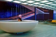
![]() It is now common for tech and media businesses to take inspiration for the design of their offices from their local Wacky Warehouse, with treehouses, slides, acid coloured cushions, chairs, play areas and other sub-juvenilia thrown into the building in the name of both ‘fun’ and an assumption that the Gen Y employees they are so patronisingly fixated on are only recently off the teat. Meanwhile some are clearly drawn back to the more sober, rational and classic styles that have long attracted corporations, especially in the US. There is something familiar about an HQ like that designed for San Francisco based software developers Giant Pixel by Studio O+A which evidently harks back to the era of modernism and post war futurism associated with architect/designers like Eero Saarinen.
It is now common for tech and media businesses to take inspiration for the design of their offices from their local Wacky Warehouse, with treehouses, slides, acid coloured cushions, chairs, play areas and other sub-juvenilia thrown into the building in the name of both ‘fun’ and an assumption that the Gen Y employees they are so patronisingly fixated on are only recently off the teat. Meanwhile some are clearly drawn back to the more sober, rational and classic styles that have long attracted corporations, especially in the US. There is something familiar about an HQ like that designed for San Francisco based software developers Giant Pixel by Studio O+A which evidently harks back to the era of modernism and post war futurism associated with architect/designers like Eero Saarinen.
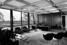
The lineage from the design of Giant Pixels’ HQ back to buildings such as Saarinen’s first major corporate interior, the Technical Center for General Motors in Warren, Michigan is evident. So it’s no surprise to learn that the brief from the occupier was to create an interior that recalled the look of the workshop used by Saarinen’s close friends Charles and Ray Eames combined with some of the post-war futuristic aesthetic of The Jetsons. The same design principles embodied in the General Motors building not only helped to make Saarinen’s name, but also become a favourite of the American corporate establishment with the architect going on to commissions from IBM and CBS amongst others.
What wasn’t part of the brief for the San Francisco HQ of Giant Pixel was the contemporary obsession with corporate prescribed fun, according to Denise Cherry of the designers. “It was up to us to marry that all together in one cohesive design,” she says in an interview in co.design. “You don’t want to create a playground; it’s a place where people work. The way we do that is through a lot of research. We are making observations to see how each group works. So if we’re placing a slide in there because it seems ‘fun,’ it’s also because it’s a direct connection to how they work.”
![]() The interior also features a bar, presumably based on the fully supportable idea that adults often get their best ideas together when socialising, even in a work context. For us, the design is a great reminder that there is nothing new under the sun, that work is what grown ups do and that the buzz of a workplace can’t be created solely with a slide and some expensive graffiti on the wall.
The interior also features a bar, presumably based on the fully supportable idea that adults often get their best ideas together when socialising, even in a work context. For us, the design is a great reminder that there is nothing new under the sun, that work is what grown ups do and that the buzz of a workplace can’t be created solely with a slide and some expensive graffiti on the wall.












Google’s new Amsterdam office exposes tech’s youthful obsessions
March 28, 2014 @ 8:44 am
[…] placed outside on a patch of fake grass. It all seems a bit needy, especially in comparison with the combination of classicism and underplayed youthfulness in the offices of another tech company, G… […]