 There are perhaps three characteristics that ensure the European office furniture and workplace design fair Orgatec continues to attract so many exhibitors and visitors to Cologne. Firstly, it takes place every two years, so offers a snapshot of a sector, framing the most important workplace developments in a particular time and place. For those of us who’ve been attending the shows for any length of time (in my case 26 years), we can track the evolution of workplace thought in a measured way, noting key developments like the launch of the Aeron chair (1994), Vitra’s Alcove (2006) and in 2018 – what?
Secondly, the office furniture firms who make up the bulk of its exhibitors operate in a ferociously competitive market which makes them extremely sensitive to the demands of customers. If organisations are focussed on an issue, it will be rendered in wood, plastic, fabric and metal at Orgatec.
Finally, it’s in Germany where they actually seem to enjoy exhibitions, catering for them with vast, easily reached halls in the heart of major cities, in contrast to the UK, which expresses its general apathy towards exhibitions by hosting them in a motley collection of inaccessible and depressing sheds. Germans love for fairs means a show like Orgatec posts decent raw numbers. This year’s event featured 753 exhibitors from 39 countries compared to 664 companies from 40 countries in 2016. The number of visitors rose from around 63,000, up from 55,000 two years ago.
A degree of homogeneity
So, what were they here to see? The first thing to say is that there is an evident degree of homogeneity in both the things people talk about and the products they create. This is structural in an industry which is so sensitive to workplace trends.
Although this makes for an intriguing show, it can also distort our perceptions of how the majority of people really work. We’ve pointed out before how this can create an apex fallacy in the market place, because for most people the day is spent in mundane surroundings at a desk in an office with blue carpets, strip lights and a couple of weeping figs, not sitting on swings and pointing at screens surrounded by an assortment of attractive, smiling millennials.
Actiforce
One of the few desks on display at Orgatec was from Knoll. This of course has prompted some people to declare that the desk is dead. We’ll be hearing a lot more of this drivel in the near future, I think. Almost certainly written by somebody sitting at a desk, in articles designed and published by somebody else sitting at a desk. Shows like Orgatec might give the impression people no longer work at desks, but they do, and they actually quite like them.
Some things never seem to change, however. There were plenty of products aping the aesthetic of mid-20th Century classics, which is still the workplace shorthand for cool and will remain so. These products are not the rip-offs that dog the sector, but they do evoke the works of Jacobsen, Eames, Panton, Saarinen and the rest in subtle ways. You could criticise the firms for producing such products but the truth is they are only creating what their customers want. If that’s something that looks a little bit like an Egg Chair but isn’t, then so it goes.
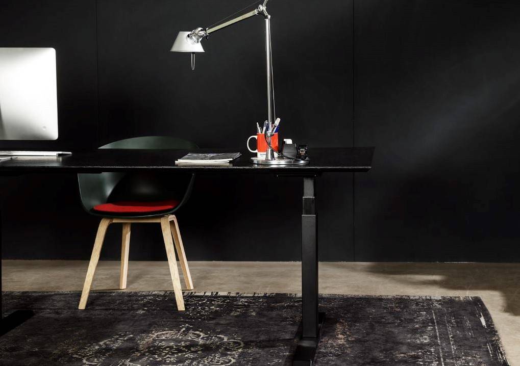
The show was also packed with sit-stand workstations. These are symbolic of an overall shift in focus away from ergonomics to wellness, from posture to movement. But they can seem restricted in their design to a slim rectangular top supported by an I-frame leg structure and a more or less discreet actuator mechanism. What sets some apart form others is a degree of refinement and the ability to accessorise. A good example is provided by the Dutch firm Actiforce who had a nicely resolved product called Elements with flexible cable management and servicing options.
Intuitive seating
Herman Miller
The same point can be made about the task seating products on show. The form of these products is restricted to some degree by their functionality, so the interesting aspects of them are often not evident at first glance. For that you have to pull the old trick of looking underneath them. What you’ll find when you do is that the best chairs are no longer host to a bewildering number of adjustment options but instead work with more sophisticated and simple mechanisms that use the weight and movement of the user to create a more intuitive product.
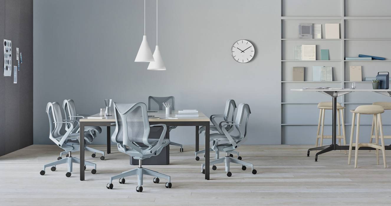
Typical of this latest generation of chairs is Herman Miller Cosm, launched this year and honoured at Orgatec with an AIT Innovation Prize for Architecture and Office.
Privacy
As it has been for a while now, the main theme of the show was acoustics. Or, it might be more accurate to say privacy, because the products at this year’s show also addressed the problem of visual privacy. It’s no longer enough to block or muffle the racket from colleagues, you should also be spared the sight of them.
Buzzispace
This is probably not unrelated to the increased use of smartphones and the growth of agile, open workplaces which bring people closer together in more ways than one. It’s also related to a growing awareness of the need to focus. We have enough distractions.
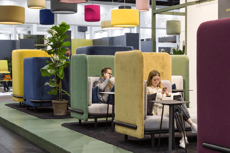
The solutions to these issues often betray their own degree of homogeneity. So, we had a selection of alcove meeting products to create cosy nests for people to work alone or in groups. There were also chairs with headrests shaped to muffle intrusions. A product we’ve seen before but seemed more prominent was the telephone booth.
Buzzispace, perhaps the pioneers of this new era of design for privacy were typically breaking new ground, this time with the launch of Buzzi Mood, which does away with the near ubiquitous felt of other acoustic panels and instead uses moss.
There were also some very nice products designed to create demountable rooms in open plan and agile working environments, including the very impressive se: cube from Sedus, also the recipient of an AIT award.
[embedyt] https://www.youtube.com/watch?v=-cJhluxQPuk[/embedyt]
Materiality
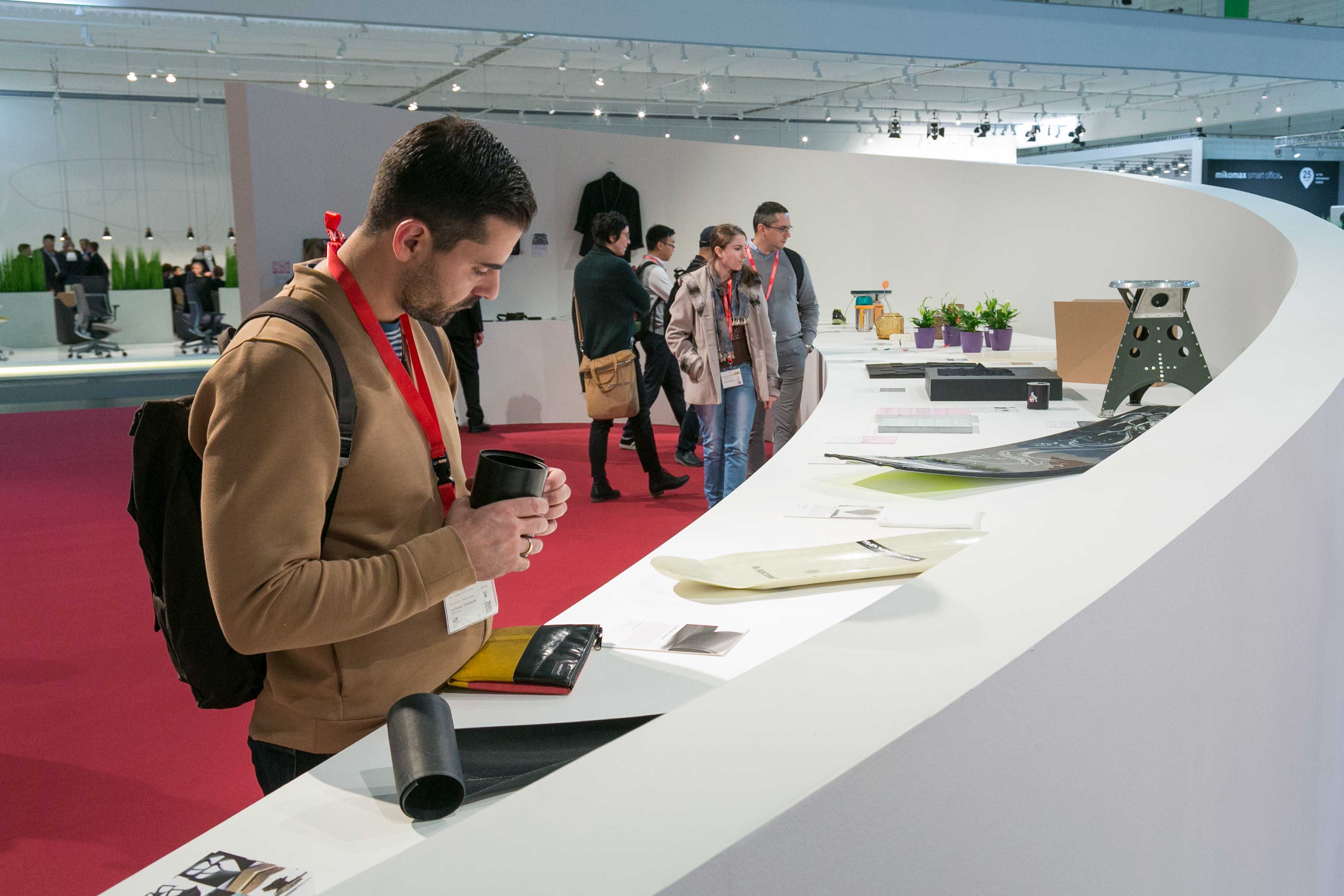 Buzzi Mood could also have found a home in perhaps the most intriguing feature at this year’s show, called Materials Culture. The display showcased possible applications for a number of natural materials as alternatives to plastics. Given the current focus on reducing plastic use, we might expect to see this approach applied in more commercial products in the future, something that might also help firms to set themselves apart from competitors.
It might also see the environment become a talked about issue at Orgatec and in the workplace media. For some time now, this has been something of a non-issue, presumably because universal compliance with green standards neutralises it. The most green thing at this year’s show was its colour palette. Many exhibitors seemed to have opted for muted pastel shades, many of them on the green part of the spectrum. I have no idea how this process happens at these things. Let’s call it synchronicity.
[embedyt] https://www.youtube.com/watch?v=Gt342ANHbzU[/embedyt]
Intersections
Steelcase
And finally, our old favourite the functional and aesthetic intersection of the workplace with other domains. Most prominently running with this particular ball were Vitra, who yet again had nearly a whole hall to themselves to showcase their Work branding – the same one they used in 2016.
One of the interesting aspects of this, in amongst the excellent new products from some of the world’s foremost industrial designers such as Konstantin Grcic and Barber & Osgerby was the influence of educational design. This was most noticeable in the way Vitra presented the CDS system designed by Antonio Citterio.
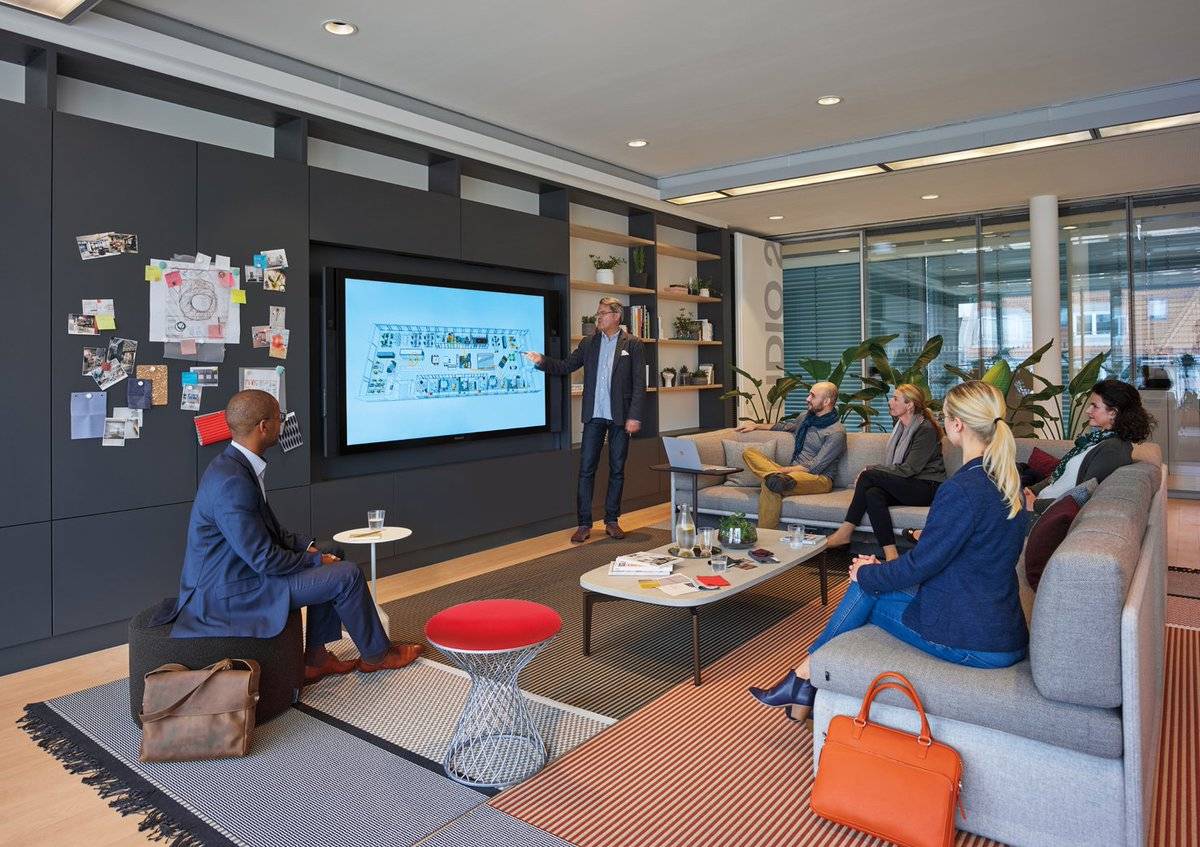
A different sort of Intersection was evident on what I thought was the show’s most important feature. The Work To Go exhibition featured a number of speakers over several days as well as providing a showcase for the new products of firms like Steelcase and Microsoft who have their own tie-up which tells us an awful lot about the crossover between the physical and digital workplace.






November 5, 2018
An intersectional approach to trends in workplace design at Orgatec 2018
by Mark Eltringham • Comment, Workplace design
Secondly, the office furniture firms who make up the bulk of its exhibitors operate in a ferociously competitive market which makes them extremely sensitive to the demands of customers. If organisations are focussed on an issue, it will be rendered in wood, plastic, fabric and metal at Orgatec.
Finally, it’s in Germany where they actually seem to enjoy exhibitions, catering for them with vast, easily reached halls in the heart of major cities, in contrast to the UK, which expresses its general apathy towards exhibitions by hosting them in a motley collection of inaccessible and depressing sheds. Germans love for fairs means a show like Orgatec posts decent raw numbers. This year’s event featured 753 exhibitors from 39 countries compared to 664 companies from 40 countries in 2016. The number of visitors rose from around 63,000, up from 55,000 two years ago.
A degree of homogeneity
So, what were they here to see? The first thing to say is that there is an evident degree of homogeneity in both the things people talk about and the products they create. This is structural in an industry which is so sensitive to workplace trends.
Although this makes for an intriguing show, it can also distort our perceptions of how the majority of people really work. We’ve pointed out before how this can create an apex fallacy in the market place, because for most people the day is spent in mundane surroundings at a desk in an office with blue carpets, strip lights and a couple of weeping figs, not sitting on swings and pointing at screens surrounded by an assortment of attractive, smiling millennials.
Actiforce
One of the few desks on display at Orgatec was from Knoll. This of course has prompted some people to declare that the desk is dead. We’ll be hearing a lot more of this drivel in the near future, I think. Almost certainly written by somebody sitting at a desk, in articles designed and published by somebody else sitting at a desk. Shows like Orgatec might give the impression people no longer work at desks, but they do, and they actually quite like them.
Some things never seem to change, however. There were plenty of products aping the aesthetic of mid-20th Century classics, which is still the workplace shorthand for cool and will remain so. These products are not the rip-offs that dog the sector, but they do evoke the works of Jacobsen, Eames, Panton, Saarinen and the rest in subtle ways. You could criticise the firms for producing such products but the truth is they are only creating what their customers want. If that’s something that looks a little bit like an Egg Chair but isn’t, then so it goes.
The show was also packed with sit-stand workstations. These are symbolic of an overall shift in focus away from ergonomics to wellness, from posture to movement. But they can seem restricted in their design to a slim rectangular top supported by an I-frame leg structure and a more or less discreet actuator mechanism. What sets some apart form others is a degree of refinement and the ability to accessorise. A good example is provided by the Dutch firm Actiforce who had a nicely resolved product called Elements with flexible cable management and servicing options.
Intuitive seating
Herman Miller
The same point can be made about the task seating products on show. The form of these products is restricted to some degree by their functionality, so the interesting aspects of them are often not evident at first glance. For that you have to pull the old trick of looking underneath them. What you’ll find when you do is that the best chairs are no longer host to a bewildering number of adjustment options but instead work with more sophisticated and simple mechanisms that use the weight and movement of the user to create a more intuitive product.
Typical of this latest generation of chairs is Herman Miller Cosm, launched this year and honoured at Orgatec with an AIT Innovation Prize for Architecture and Office.
Privacy
As it has been for a while now, the main theme of the show was acoustics. Or, it might be more accurate to say privacy, because the products at this year’s show also addressed the problem of visual privacy. It’s no longer enough to block or muffle the racket from colleagues, you should also be spared the sight of them.
Buzzispace
This is probably not unrelated to the increased use of smartphones and the growth of agile, open workplaces which bring people closer together in more ways than one. It’s also related to a growing awareness of the need to focus. We have enough distractions.
The solutions to these issues often betray their own degree of homogeneity. So, we had a selection of alcove meeting products to create cosy nests for people to work alone or in groups. There were also chairs with headrests shaped to muffle intrusions. A product we’ve seen before but seemed more prominent was the telephone booth.
Buzzispace, perhaps the pioneers of this new era of design for privacy were typically breaking new ground, this time with the launch of Buzzi Mood, which does away with the near ubiquitous felt of other acoustic panels and instead uses moss.
There were also some very nice products designed to create demountable rooms in open plan and agile working environments, including the very impressive se: cube from Sedus, also the recipient of an AIT award.
[embedyt] https://www.youtube.com/watch?v=-cJhluxQPuk[/embedyt]
Materiality
It might also see the environment become a talked about issue at Orgatec and in the workplace media. For some time now, this has been something of a non-issue, presumably because universal compliance with green standards neutralises it. The most green thing at this year’s show was its colour palette. Many exhibitors seemed to have opted for muted pastel shades, many of them on the green part of the spectrum. I have no idea how this process happens at these things. Let’s call it synchronicity.
[embedyt] https://www.youtube.com/watch?v=Gt342ANHbzU[/embedyt]
Intersections
Steelcase
And finally, our old favourite the functional and aesthetic intersection of the workplace with other domains. Most prominently running with this particular ball were Vitra, who yet again had nearly a whole hall to themselves to showcase their Work branding – the same one they used in 2016.
One of the interesting aspects of this, in amongst the excellent new products from some of the world’s foremost industrial designers such as Konstantin Grcic and Barber & Osgerby was the influence of educational design. This was most noticeable in the way Vitra presented the CDS system designed by Antonio Citterio.
A different sort of Intersection was evident on what I thought was the show’s most important feature. The Work To Go exhibition featured a number of speakers over several days as well as providing a showcase for the new products of firms like Steelcase and Microsoft who have their own tie-up which tells us an awful lot about the crossover between the physical and digital workplace.