March 25, 2024
Biophilic design has a long history and an even bigger future
 There are plenty of definitions of the modish concept of biophilic design around right now. But perhaps nobody can top that of Erich Fromm, the sociologist and psychoanalyst who first described it in his 1973 book The Anatomy of Human Destructiveness as “The passionate love of life and all that is alive”.
The term biophilia was later popularised more dryly in a 1984 book by the biologist Edward O. Wilson who argued that we yearn for a connection with nature. It is this idea, of our hardwired desire for the natural world, that continues to drive the discussion.
The term may be new, but the idea isn’t. Nor is its application in the built environment.
The first golden age of biophilia arrived in the Mid-Twentieth Century, ushered in by the rise of multinational corporations. At first these firms established themselves in cities but as their focus shifted to research and development, they moved to rural areas, where space was plentiful and cheap, establishing campuses far from the eyes of potential industrial spies.
The spaces they created resembled university campuses in both form and function, set in landscaped grounds and openly flaunting a connection to nature and the firm’s apparent social awareness. Throughout the 1950s and 1960s firms such as General Electric, AT&T Bell and John Deere created campuses in idyllic setting across the US.
In the UK, pharmaceutical firm ICI bought the dilapidated hall and 350 acres of surrounding parkland at Alderley Park in Cheshire in 1950 to create its own bucolic campus, which included farmland and ponds alongside the research buildings.
This approach is described in the book Pastoral Capitalism: A History of Suburban Corporate Landscapes by Professor Louise Mozingo, which claims that the apogee of this phenomenon was the Deere & Company Administrative Center in Moline, Illinois. She argues that the main building, brilliantly designed as it was by Eero Saarinen, derives its value primarily from its setting. It allowed people a sight of wooded hillsides, pools and a lush valley created by the landscape architect Hideo Sasaki.

John Deere World Headquarters in Moline, Illinois
An enduring model
This model of biophilic design remains, as the best-known campuses of the world’s tech giants prove. Apple’s campus in Cupertino consists of a monolithic circular building set in landscaped grounds and a garden at its centre. However, the design owes less to the aesthetic of the university campus than that of some of its predecessors. It is manifestly a corporate space.
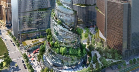
So too is the recently announced HQ2 of Amazon which has eschewed a rural setting in favour of a city centre location in Arlington, Virginia. The plans for the $2.5 billion campus announced in February include a 350 ft glass tower, three 22-storey towers offering 2.8 million sq. ft of office space, a 250-seat outdoor amphitheatre, public green space, and other buildings. The centre piece is a plant covered tower which the firm says emphasises its commitment to the environment and biophilic design.
[perfectpullquote align=”right” bordertop=”false” cite=”” link=”” color=”” class=”” size=””]Just looking at images of nature can be enough to lower your work stress levels[/perfectpullquote]
Unlike many of the campuses of the past, this is a very controlled environment. More greenhouse than landscape. It also confirms something we have learned about biophilic design; that natural forms can improve our wellbeing almost as much as actual nature.
Jeff Bezos made this intention explicit when describing the double helix structure of the main tower at HQ2. “The natural beauty of a double helix can be seen throughout our world, from the geometry of our own DNA to the elemental form of galaxies, weather patterns, pinecones, and seashells”, he claimed.
Researchers led by Vrije University Medical Centre in the Netherlands recently explored how looking at images of natural scenes and forms could improve feelings of wellbeing. Participants outfitted with sensors to monitor heart rates and stress levels had to solve mathematical problems.
After this, they would view one of two series of pictures. Both depicted urban environments, but one included greenery amongst buildings, while the other showed only buildings. The findings, reported in the International Journal of Environmental Research and Public Health, were that participants who viewed natural images had lower stress levels and felt more rested afterwards.
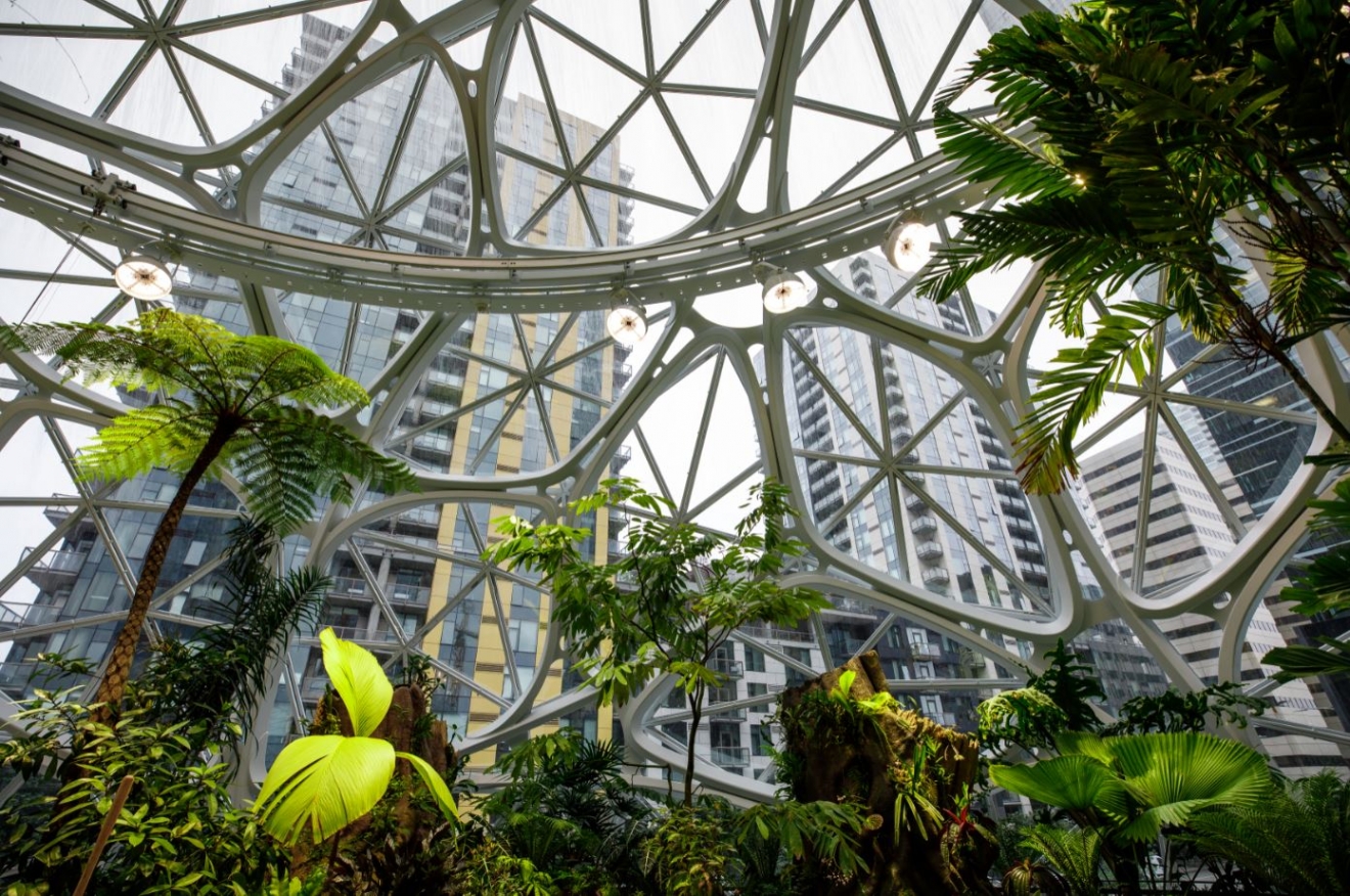
The real thing
Still, nothing beats the real thing. One peer-reviewed academic study of 20,000 people published recently in the journal Nature Communications found that time spent in natural surroundings is worth about £4.5 trillion a year in terms of improved mental health alone.
[perfectpullquote align=”right” bordertop=”false” cite=”” link=”” color=”” class=”” size=””]The burgeoning interest in biophilia is a sign of how organisations are looking at sophisticated ways of meeting a number of interrelated business challenges[/perfectpullquote]
The burgeoning interest in biophilia is a sign of how organisations are looking at sophisticated ways of meeting a number of interrelated business challenges, not least engaging with employees and looking after their wellbeing while improving productivity. Biophilic design has shown itself to have a number of demonstrably beneficial outcomes in this regard.
It is also a very contemporary way of addressing issues of productivity and wellbeing. The approach adopted by enlightened employers is about creating cultures and environments that foster engagement, improve wellbeing, address stresses and pressures and help people be more productive. Biophilia plays an essential role in this.
Mother Nature believes that form follows function just as much any human designer. The things that exist in the natural world look the way they do solely on the basis of what they are for and so for very good reasons indeed.
Mankind is usually playing catch up with these things, and so we are increasingly able to understand the principles of how and why nature does the things it does. Those same principles can now be applied to the forms we create when we design an office. Technology allows us not only to mimic nature in the form of imagery, textures and colours but also adopt some of its practicality and functionality.
This field of study is known as biomimetics. It is closely related to the idea of biomimicry which is more widely recognised as a term but has been subverted somewhat unfairly to describe the design of materials and objects that look like natural objects.
Biomimetics, on the other hand, more accurately describes the design of things that ape the function of natural forms. It’s easy to see why this process would appeal to designers. These forms have been developed and refined by natural forces over hundreds of millions of years to create perfect solutions to specific challenges. Nature is rarely wasteful and invariably creates forms perfectly aligned to functions. We can only benefit from understanding how these forms came about and what they achieve.
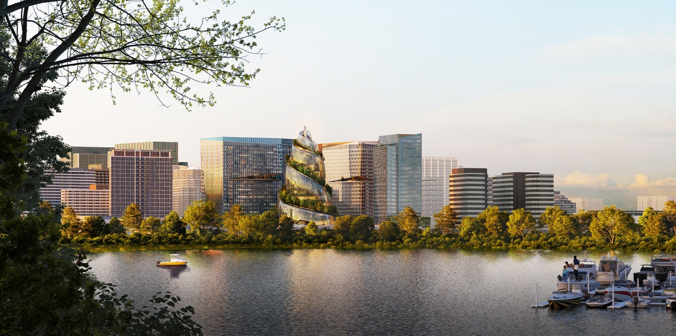
Amazon HQ2
A sense of harmony
It was the architect Frank Lloyd Wright who once said: “harmony between human habitation and the natural world through design approaches so sympathetic and well integrated with its site that buildings, furnishings, and surroundings become part of a unified, interrelated composition.” He practiced what he preached, especially with what is perhaps his most famous design, the Fallingwater house.
[perfectpullquote align=”right” bordertop=”false” cite=”” link=”” color=”” class=”” size=””]The importance of these physiological states on individual and community health is fundamental and wide-ranging[/perfectpullquote]
The design of Fallingwater reminds us that the best examples of biophilia are not just about livening our surroundings up with plants but the creation of something that harmonises with nature. And when it comes to the design of offices, that also means harmonising with human nature.
As the psychologist Oliver Sacks once wrote in an essay called Why We Need Gardens: “As a writer, I find gardens essential to the creative process; as a physician, I take my patients to gardens whenever possible. All of us have had the experience of wandering through a lush garden or a timeless desert, walking by a river or an ocean, or climbing a mountain and finding ourselves simultaneously calmed and reinvigorated, engaged in mind, refreshed in body and spirit. The importance of these physiological states on individual and community health is fundamental and wide-ranging. In forty years of medical practice, I have found only two types of non-pharmaceutical “therapy” to be vitally important for patients with chronic neurological diseases: music and gardens.”
So, with all of these examples and all of this research why is it we still fail to create environments that tap into the full potential of biophilic design and offer people the basic natural resources they crave, not least natural light, fresh air and a connection to the outside world?
Perhaps part of the problem is that we tend to look for simple answers to complex problems. So, we pay lip service to biophilic design by specifying some plants in the office or hanging a picture of some trees on the wall.
Or maybe this is too cynical. After all, not every organisation has the kind of workplace setting that can accommodate the sorts of views enjoyed by workers at John Deere in the 20th Century. Perhaps that is why organisations rely on glimpses of nature rather than immersion.
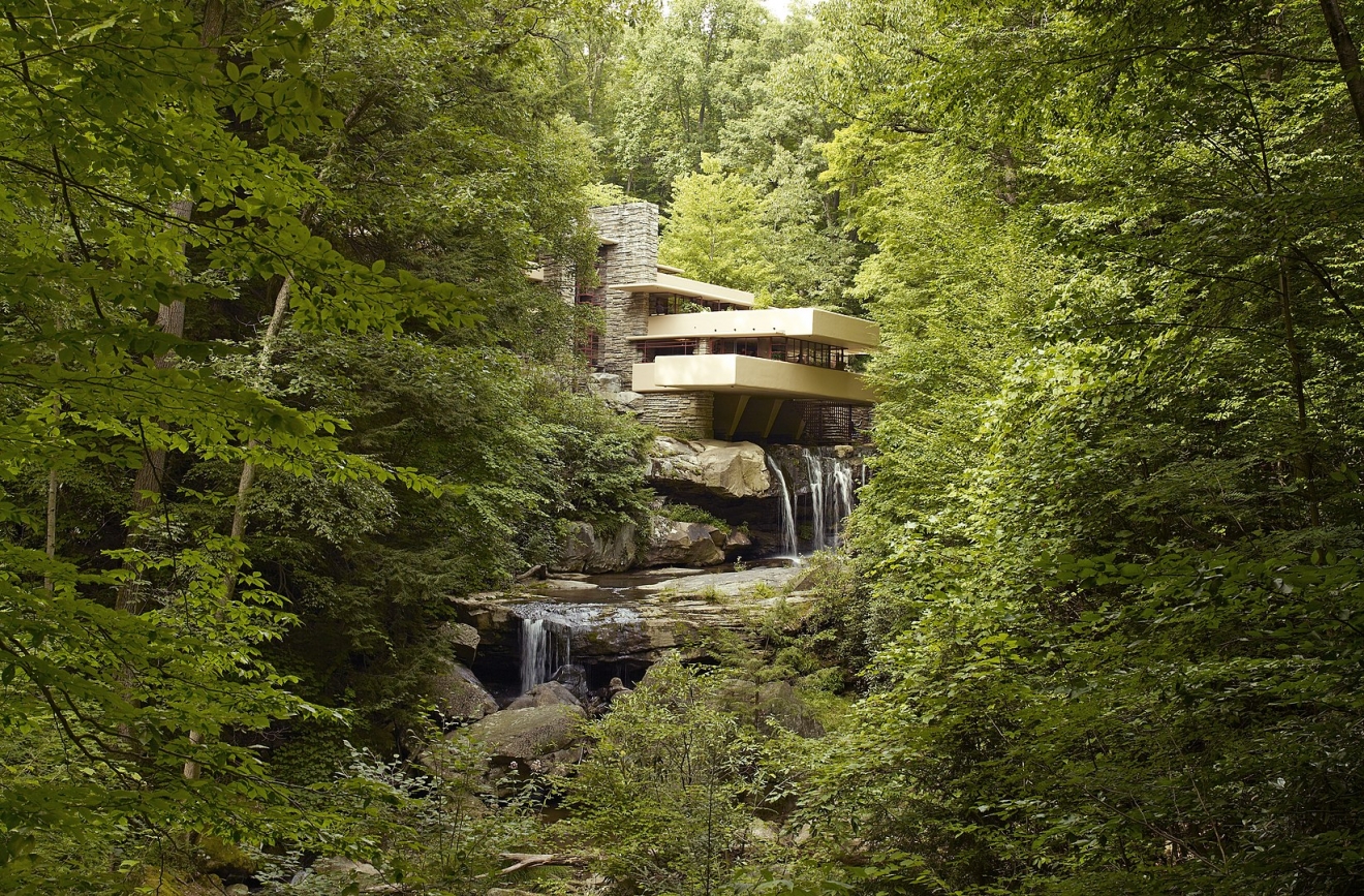
Fallingwater. Carol M. Highsmith. Public domain.
People matter
In “The Practice of Biophilic Design” the authors Stephen R. Kellert & Elizabeth F. Calabrese identify one of three experiences that biophilic design creates in order to build a more beneficial environment for its inhabitants as “experiences of space and place.” A major aspect of this is creating unique attachment to a specific place – culturally, ecologically, geographically, historically or some combination thereof.
[perfectpullquote align=”right” bordertop=”false” cite=”” link=”” color=”” class=”” size=””]The traditional dichotomy people have applied between health and illness is not sufficient to describe the constantly changing continuum of outcomes people experience[/perfectpullquote]
The issue may also be entering a new phase. We may be hearing a lot more about salutogenic design in the near future.
Salutogenesis is a term coined by the medical sociologist Anton Antonovsky and describes his research in the 1970s and 1980s into the links between stress and physical and mental health. He found that the traditional dichotomy people had applied between health and illness was not sufficient to describe the constantly changing continuum of outcomes people experience in their daily lives. He derived the term as an antonym to pathogenesis which describes how ill health is treated after a condition has become evident.
He was particularly focused on how different people respond to the ubiquitous presence of stress. He noted how certain people not only did not suffer the ill effects of stress that others found disabling. He explained this by suggesting that the issue was one of an individual’s sense of coherence, a term that links to the idea to what we understand about how biophilic design is a way of connecting us to the world.
Coherence here is defined as “a global orientation that expresses the extent to which one has a pervasive, enduring though dynamic feeling of confidence that the stimuli deriving from one’s internal and external environments in the course of living are structured, predictable and explicable; the resources are available to one to meet the demands posed by these stimuli; and these demands are challenges, worthy of investment and engagement.” Antonovsky went on to conclude that “beyond the specific stress factors that one might encounter in life, and beyond your perception and response to those events, what determines whether stress will cause you harm is whether or not the stress violates your sense of coherence”.
Coherent thinking
It’s interesting to note that within the definition of sense of coherence there is a role to play for the external environment. In other words, it is possible to help people develop a sense of coherence in their surroundings, which we can take to mean both their physical and cultural environment. This subject has already been explored by designers and researchers but the current focus on wellbeing and design may mean that its real time is yet to come.
Alan Dilani, the Founder of the International Academy for Design and Health (IADH) and Co-founder of the journal World Health Design published a 2008 study into the link in the journal Design and Health Scientific Review, called Psychosocially supportive design: A salutogenic approach to the design of the physical environment, concluding that ‘while clinical practice focuses on treating illness, there’s also a raft of research to suggest that the quality of our everyday surroundings has a highly important role to play in sustaining wellness.’
When they make the workplace more manageable in terms of activity-based working, control over ambient conditions, the ability to relax, the provision of ergonomic products and access to natural light and fresh air, they are adding to an individual’s sense of coherence.
When they make work meaningful with a sense of community, an understanding of how an individual’s role affects the organisation and wider world and how the firm cares for the environment, they are adding to an individual’s sense of coherence.
When they make the workplace and work comprehensible with wayfinding clues, colour, branding, landscaping, acoustics and sightlines, they are adding to an individual’s sense of coherence.
Biophilic design has already achieved mainstream understanding and it wouldn’t be a surprise to see salutogenic design as the next idea to cross over into mainstream business thinking.
This feature is taken from issue 7 of IN Magazine


