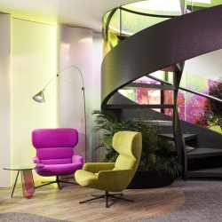
 It is now a truism to suggest that the traditional ways we think about office design need to be rethought in response to the new and emerging challenges businesses now face. Most people accept this but are still trying to work out the implications for the way we design and manage the physical workplace. The office needs to tell a new story. And one way to structure this narrative this is to borrow ideas from the movie screenwriting process.
There are some limitations to this of course. Most importantly, architecture doesn’t usually follow the linear trajectory of a typical screenplay. It has many connected and intersecting paths and ideally is designed to change over time. An office is a living thing.
But it is also something that should spark emotions from the people who use the space. One important thing to note is that these emotions are not fixed over time. The feelings evoked in somebody when first entering a space are markedly different to those of somebody who uses the office every day.
For the first time visitor, the most immediate response will be to the aesthetics of the space. But over time, the initial impact of this element of an office design will fade into the background and be replaced by new, less visceral priorities, most typically those to do with privacy, acoustics, concentration and focus.
[perfectpullquote align=”right” bordertop=”false” cite=”” link=”” color=”” class=”” size=””]In the longer run, people tend to prioritise peace and quiet over the emotional thump of a beautiful space[/perfectpullquote]
Getting the balance right is essential. The emotional response is still needed for the business’s clients and other stakeholders as well as job applicants and new team members. But in the longer run, people tend to prioritise peace and quiet over the emotional thump of a beautiful space.
An added tension is that the initial brief for a designer is often to create a WOW effect, that mixture of delight and surprise. Over time, people can develop a sense of anticipation as their interest is piqued by glimpses of a space. But that hit of joy is always dependent on the skill of the designer. Clients also typically want to create a welcoming and relaxing reception and lounge space.
To achieve this balance, express a brand identity and create a meaningful narrative as people move through the office and work with it over time, it’s essential for its designer to offer a wide and adaptable toolset. This means that each space within the office has a set of characteristics that optimise the way it can be used. Among the most important are sound levels, acoustic privacy, the type and level of light, colour, texture and materials.
And because one of the most important determinants of productivity of an individual is their ability to focus, the designer must always strike the right balance based on the tasks people do and the nature of the business.
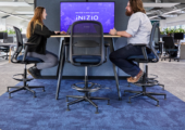
In open plan spaces it is important that people can switch between tasks and shift their focus from what they are doing to be able to communicate with colleagues when needed. Conversely, deep focus spaces are ideal for monotasking.
The reception area is not merely the handshake of the building, but also marks the boundary between the office and the outside world, between work and the rest of life. So, it should nudge each person into a different mindset when either entering or exiting a building.
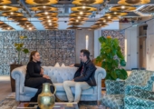
Lounges, cafés, break out spaces and kitchens should signal that these are spaces in which to relax. Design subtleties can also indicate to people that a lounge space may also be used for individual periods of private relaxation, whereas a kitchen or café should be more about communicating with others. In either case, people should leave the space energised.
Design is constantly shifting in response to the progress of technology. So, if you are planning to design a new office or redesign an existing space, it’s important to work with designers who are in step with both you and the latest technology. This will help you to create an office that strike the right balance between the emotional hit of a beautifully designed space with the practical demand from its users for a space that allows them to focus and optimises their productivity and wellbeing.
Main image: ZIKZAK










July 25, 2023
Putting a new approach to office design in the frame
by Kyrylo Komarov • Comment, Workplace design
There are some limitations to this of course. Most importantly, architecture doesn’t usually follow the linear trajectory of a typical screenplay. It has many connected and intersecting paths and ideally is designed to change over time. An office is a living thing.
But it is also something that should spark emotions from the people who use the space. One important thing to note is that these emotions are not fixed over time. The feelings evoked in somebody when first entering a space are markedly different to those of somebody who uses the office every day.
For the first time visitor, the most immediate response will be to the aesthetics of the space. But over time, the initial impact of this element of an office design will fade into the background and be replaced by new, less visceral priorities, most typically those to do with privacy, acoustics, concentration and focus.
[perfectpullquote align=”right” bordertop=”false” cite=”” link=”” color=”” class=”” size=””]In the longer run, people tend to prioritise peace and quiet over the emotional thump of a beautiful space[/perfectpullquote]
Getting the balance right is essential. The emotional response is still needed for the business’s clients and other stakeholders as well as job applicants and new team members. But in the longer run, people tend to prioritise peace and quiet over the emotional thump of a beautiful space.
An added tension is that the initial brief for a designer is often to create a WOW effect, that mixture of delight and surprise. Over time, people can develop a sense of anticipation as their interest is piqued by glimpses of a space. But that hit of joy is always dependent on the skill of the designer. Clients also typically want to create a welcoming and relaxing reception and lounge space.
To achieve this balance, express a brand identity and create a meaningful narrative as people move through the office and work with it over time, it’s essential for its designer to offer a wide and adaptable toolset. This means that each space within the office has a set of characteristics that optimise the way it can be used. Among the most important are sound levels, acoustic privacy, the type and level of light, colour, texture and materials.
And because one of the most important determinants of productivity of an individual is their ability to focus, the designer must always strike the right balance based on the tasks people do and the nature of the business.
In open plan spaces it is important that people can switch between tasks and shift their focus from what they are doing to be able to communicate with colleagues when needed. Conversely, deep focus spaces are ideal for monotasking.
The reception area is not merely the handshake of the building, but also marks the boundary between the office and the outside world, between work and the rest of life. So, it should nudge each person into a different mindset when either entering or exiting a building.
Lounges, cafés, break out spaces and kitchens should signal that these are spaces in which to relax. Design subtleties can also indicate to people that a lounge space may also be used for individual periods of private relaxation, whereas a kitchen or café should be more about communicating with others. In either case, people should leave the space energised.
Design is constantly shifting in response to the progress of technology. So, if you are planning to design a new office or redesign an existing space, it’s important to work with designers who are in step with both you and the latest technology. This will help you to create an office that strike the right balance between the emotional hit of a beautifully designed space with the practical demand from its users for a space that allows them to focus and optimises their productivity and wellbeing.
Kyrylo Komarov is Chief Technology Officer at ZIKZAK architects
Main image: ZIKZAK