 Because we are now so immersed in technology, we can sometimes forget just how young the Internet is. It was only in 1995 that the final barriers to its full commercial development were removed. In 1994, the number of people using it worldwide was estimated at around 20 million, there were under 15,000 company websites and the UK had one ‘cybercafe’. Even so, there was something in the air. A sense that everything was about to change – and change spectacularly.
The management writer Charles Handy was outlining a new world of work in which people developed portfolio careers, organisations were formed from ‘shamrocks’ of freelancers, core staff and part time employees, a world in which half the people would work twice as hard. There was excited talk about new forms of office design and ways of working such as telecommuting and hot desking.
The world that emerged has broadly followed the trajectory of these forecasts, even if the details have proved very different.
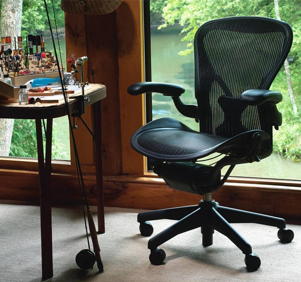 It wasn’t just management writers who were engaged by the world to come. Design writers such as Frank Duffy of DEGW (now AECOM) and Franklin Becker of Cornell University were exploring the implications of the emerging world in their work. And 1994 was a watershed year for furniture designers. Not only was it the year that saw the Aeron Chair presented to a mildly bewildered then excited world, it also saw the emergence of a new generation of desking systems based on the principles and around a language that continue to define the way we design and talk office furniture to this day.
It’s worth reminding ourselves what counted as mainstream furniture design at that time. In the case of Aeron, the design may as well have come from another planet, when compared to the heavily upholstered designs that it sought to (and eventually did) knock into a cocked hat. It looked so odd and met with such a negative reaction from its test focus groups that Herman Miller had doubts about launching it at all. Yet its ultimate success made it the perfect example for Malcolm Gladwell to use in describing how radical ideas go mainstream in his book Blink, it is by some distance the most commercially successful task seating design in history and enjoys truly iconic status.
When furniture was an extension of the building
It may well be less talked about these days, but 1994 also saw a number of office furniture systems launched that proved to be equally and proactively prophetic about the world to come. Up to this point most office furniture was characterised by its sheer scale, the consequence of the piles of paper and the PCs perched on their oak veneered tops.
Equally heavily engineered were the structures and cable management systems that proliferated under these worksurfaces and within the screens and partitions that surrounded them. Indeed manufacturers would boast of the architectural scale of these things with some screen systems renamed ‘walls’, up to 8 inches thick, with detachable panels and huge segregated internal channels to act as an alternative to the raised floors and floor boxes of the building. Schematics would demonstrate how the furniture could be used as an extension of the building itself. Organisational change, they suggested, should be accommodated by giving everybody the same desk and getting them to move around the building so the furniture didn’t have to. The desks should stay put, almost as static as the bricks and mortar of the building.
The new generation of products launched that year in Cologne and Chicago had a different vision. The furniture, far from being part of the building, should be an extension of the individual and as changeable their needs. Each element should be freestanding and adaptable, desks were smaller, some tables and pedestals were given wheels, some were height adjustable, screens and storage were detached from desks, technology was accommodated lightly, anticipating the popularisation of laptops, mobile phones and WiFi.
Furniture of the moment and ahead of its time
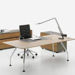
Perhaps the best known of this generation of products remains Ad Hoc (top), designed by Antonio Citterio for Vitra, and still a key part of the company’s range. Looking at it now, it is hard to picture just how radical it was and how exciting for the people seeing it for the first time at the Orgatec exhibition which was also the first time many Europeans had to acquaint their behinds with the pellicule seat of the Aeron. Ad Hoc was modular, and as its name suggests, designed to be changed by the user themselves as and when they needed.
Kyo
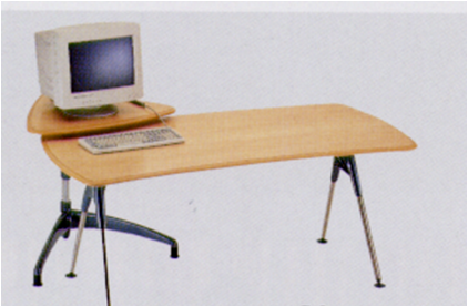
One other product that was equally forward thinking but which, unlike Ad Hoc is no longer with us was a product called Kyo designed by Roger Carr, David Williams and Ben Fether of FM Design and developed and produced by British manufacturer President. If anything, Kyo took the principles of flexibility and modularity espoused by Ad Hoc to another plane. Instead of fixed rectangular screens, it offered clip-on fabric kites and cable spines. Even the worksurfaces weren’t oblong, but curved and kidney shaped to wrap around the user, with wheeled extensions to sit alongside. In this regard at least, Kyo, unlike Ad Hoc, failed to anticipate the rise of the bench system.
However radical they seemed at the time, the principles behind such ranges are now mainstream. The large personal workstation, once the core element of office design, has seen its prominence eroded and vanish. The workplace is flexible, modular, technophilic, individualistic, comfortable, relaxed and informal, adjectives that were not generally applicable before 1994, the year it all changed.
___________________________________
Colin Watson is the CEO of business consultancy Watson King






April 2, 2019
A quarter of a century ago, the newborn Internet set office design on a different path
by Colin Watson • Comment, Furniture, Workplace design
The management writer Charles Handy was outlining a new world of work in which people developed portfolio careers, organisations were formed from ‘shamrocks’ of freelancers, core staff and part time employees, a world in which half the people would work twice as hard. There was excited talk about new forms of office design and ways of working such as telecommuting and hot desking.
The world that emerged has broadly followed the trajectory of these forecasts, even if the details have proved very different.
It’s worth reminding ourselves what counted as mainstream furniture design at that time. In the case of Aeron, the design may as well have come from another planet, when compared to the heavily upholstered designs that it sought to (and eventually did) knock into a cocked hat. It looked so odd and met with such a negative reaction from its test focus groups that Herman Miller had doubts about launching it at all. Yet its ultimate success made it the perfect example for Malcolm Gladwell to use in describing how radical ideas go mainstream in his book Blink, it is by some distance the most commercially successful task seating design in history and enjoys truly iconic status.
When furniture was an extension of the building
It may well be less talked about these days, but 1994 also saw a number of office furniture systems launched that proved to be equally and proactively prophetic about the world to come. Up to this point most office furniture was characterised by its sheer scale, the consequence of the piles of paper and the PCs perched on their oak veneered tops.
Equally heavily engineered were the structures and cable management systems that proliferated under these worksurfaces and within the screens and partitions that surrounded them. Indeed manufacturers would boast of the architectural scale of these things with some screen systems renamed ‘walls’, up to 8 inches thick, with detachable panels and huge segregated internal channels to act as an alternative to the raised floors and floor boxes of the building. Schematics would demonstrate how the furniture could be used as an extension of the building itself. Organisational change, they suggested, should be accommodated by giving everybody the same desk and getting them to move around the building so the furniture didn’t have to. The desks should stay put, almost as static as the bricks and mortar of the building.
The new generation of products launched that year in Cologne and Chicago had a different vision. The furniture, far from being part of the building, should be an extension of the individual and as changeable their needs. Each element should be freestanding and adaptable, desks were smaller, some tables and pedestals were given wheels, some were height adjustable, screens and storage were detached from desks, technology was accommodated lightly, anticipating the popularisation of laptops, mobile phones and WiFi.
Furniture of the moment and ahead of its time
Perhaps the best known of this generation of products remains Ad Hoc (top), designed by Antonio Citterio for Vitra, and still a key part of the company’s range. Looking at it now, it is hard to picture just how radical it was and how exciting for the people seeing it for the first time at the Orgatec exhibition which was also the first time many Europeans had to acquaint their behinds with the pellicule seat of the Aeron. Ad Hoc was modular, and as its name suggests, designed to be changed by the user themselves as and when they needed.
Kyo
One other product that was equally forward thinking but which, unlike Ad Hoc is no longer with us was a product called Kyo designed by Roger Carr, David Williams and Ben Fether of FM Design and developed and produced by British manufacturer President. If anything, Kyo took the principles of flexibility and modularity espoused by Ad Hoc to another plane. Instead of fixed rectangular screens, it offered clip-on fabric kites and cable spines. Even the worksurfaces weren’t oblong, but curved and kidney shaped to wrap around the user, with wheeled extensions to sit alongside. In this regard at least, Kyo, unlike Ad Hoc, failed to anticipate the rise of the bench system.
However radical they seemed at the time, the principles behind such ranges are now mainstream. The large personal workstation, once the core element of office design, has seen its prominence eroded and vanish. The workplace is flexible, modular, technophilic, individualistic, comfortable, relaxed and informal, adjectives that were not generally applicable before 1994, the year it all changed.
___________________________________
Colin Watson is the CEO of business consultancy Watson King