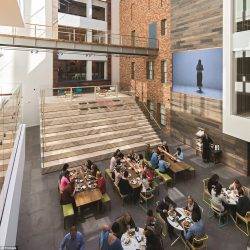
 Some people would have you believe that the office is dying out. But the absolute dead giveaway that it is not is the creation of tech enclaves and palaces around the world that exists solely to bring lots of people to work together in real space and real time. Some of these buildings are presented in a new book called HQ: Nerve Centres of the World’s Leading Brands from Irish publishers Roads (link is to Amazon but please try to order from a local bookshop if possible). The high tech homes of the likes of Google, Facebook, Microsoft and Vodafone are presented alongside similar examples from eight other business sectors: Finance, Retail, Motoring, Media, Drinks, Fashion, Sport and Design & Innovation.
Because of the book’s format and focus on corporate branding, it invites the reader to muse on the way that firms and whole sectors see themselves. This is an intriguing conceit but the book lacks a focus on the actual work that gets done in these places. There are very few people pictured and of those that are, the vast majority are moving through the public spaces of the buildings. These are people between work, and the camera’s gaze is not drawn to the mundanity of meetings and workstations. Even though the foreword talks of a ‘wow moment’, it goes on to consider the role of the workplace in motivating and inspiring staff, even though nobody seems to be doing anything in these palatial surroundings.
We are regularly told these days that there is now a diverse ecosystem of office forms that mirror the identity and structure of their occupiers. It is in this regard that the book comes alive.
The finance sector seems to like its towers and corporate monoliths as evidenced by the likes of J P Morgan, HSBC and Lloyds. These are primarily anti-human buildings. The most humane office in this section is that of the Cooperative Group in Manchester and that is not primarily a financial services firm. The rest seem designed to cow the people within and around them.
Perhaps more surprisingly the same is also largely true of the case studies presented for the media sector. For the most part these are buildings that are designed to impress rather than embrace people, although the offices of United Talent Agency in Beverly Hills reflect the welcoming human-scaled design we might more commonly associate with a firm working in the sector.
Firms working in the fashion industry most evidently see their offices as an extension of their retail outlets. However, fans of the movie Zoolander will be delighted to note that the headquarters of Fendi are described as ‘an iconic example of fascist architecture’. Giorgio Armani has used its famously muted grey colour palette in its monolithic interior and the result is something that evokes the Holocaust Tower at the Jewish Museum in Berlin. Not good.
Unsurprisingly, firms in the retail sector tend to derive inspiration from their shops. One notable exception is Net a Porter in London whose offices are (pleasantly) redolent of a hotel lobby or airport lounge. Similarly, Primark’s offices are bright and attractive
Those firms active in the drinks sector want to make sure that people know it. Guinness’s Dublin home is an attractive red brick building with an unmistakeable North American feel derived from its use of Chicago style architecture. The Spanish wine make Ysios has a lovely home that reflects the rolling hills of its landscape and also the barrels that it uses. Whisky maker Lagavulin has no truck with any corporate nonsense and its distillery is perfectly at home on the seafront of Islay. Moët et Chandon is similarly at home in an Epernay château.
Both the sport and motor sectors take a fairly literal approach to the use of identity in their headquarters. The good people at Puma and converse work in an extension of a store. The new HQ of BMW is inspired by engine cylinders. Exceptions are Aston Martin and Bugatti whose emphasis is on heritage. Meanwhile Ferrari have opted knowingly for a theme park dominated by what looks like a vast red squid from the air.
The technology businesses presented in the book do not want to be perceived as corporate beasts (even though they are), instead choosing to work on campuses that reflect both an ostensibly more relaxed attitude to work and a focus on research and ideas. One exception is NetDragon who have gone full nerd with a life size simulacrum of the Starship Enterprise.
The most humane interiors are associated with the Design and innovation sectors. Although there is the obligatory foosball table at Mattel, at least these interiors seem to be focussed on human beings. At Fujitsu we even get to see some people talking to each other, the real reason these offices exist in the first place








December 8, 2016
Book review…. HQ:Nerve Centres of the World’s Leading Brands 0
by Mark Eltringham • Case studies, Comment, Workplace design
Because of the book’s format and focus on corporate branding, it invites the reader to muse on the way that firms and whole sectors see themselves. This is an intriguing conceit but the book lacks a focus on the actual work that gets done in these places. There are very few people pictured and of those that are, the vast majority are moving through the public spaces of the buildings. These are people between work, and the camera’s gaze is not drawn to the mundanity of meetings and workstations. Even though the foreword talks of a ‘wow moment’, it goes on to consider the role of the workplace in motivating and inspiring staff, even though nobody seems to be doing anything in these palatial surroundings.
We are regularly told these days that there is now a diverse ecosystem of office forms that mirror the identity and structure of their occupiers. It is in this regard that the book comes alive.
The finance sector seems to like its towers and corporate monoliths as evidenced by the likes of J P Morgan, HSBC and Lloyds. These are primarily anti-human buildings. The most humane office in this section is that of the Cooperative Group in Manchester and that is not primarily a financial services firm. The rest seem designed to cow the people within and around them.
Perhaps more surprisingly the same is also largely true of the case studies presented for the media sector. For the most part these are buildings that are designed to impress rather than embrace people, although the offices of United Talent Agency in Beverly Hills reflect the welcoming human-scaled design we might more commonly associate with a firm working in the sector.
Firms working in the fashion industry most evidently see their offices as an extension of their retail outlets. However, fans of the movie Zoolander will be delighted to note that the headquarters of Fendi are described as ‘an iconic example of fascist architecture’. Giorgio Armani has used its famously muted grey colour palette in its monolithic interior and the result is something that evokes the Holocaust Tower at the Jewish Museum in Berlin. Not good.
Unsurprisingly, firms in the retail sector tend to derive inspiration from their shops. One notable exception is Net a Porter in London whose offices are (pleasantly) redolent of a hotel lobby or airport lounge. Similarly, Primark’s offices are bright and attractive
Those firms active in the drinks sector want to make sure that people know it. Guinness’s Dublin home is an attractive red brick building with an unmistakeable North American feel derived from its use of Chicago style architecture. The Spanish wine make Ysios has a lovely home that reflects the rolling hills of its landscape and also the barrels that it uses. Whisky maker Lagavulin has no truck with any corporate nonsense and its distillery is perfectly at home on the seafront of Islay. Moët et Chandon is similarly at home in an Epernay château.
Both the sport and motor sectors take a fairly literal approach to the use of identity in their headquarters. The good people at Puma and converse work in an extension of a store. The new HQ of BMW is inspired by engine cylinders. Exceptions are Aston Martin and Bugatti whose emphasis is on heritage. Meanwhile Ferrari have opted knowingly for a theme park dominated by what looks like a vast red squid from the air.
The technology businesses presented in the book do not want to be perceived as corporate beasts (even though they are), instead choosing to work on campuses that reflect both an ostensibly more relaxed attitude to work and a focus on research and ideas. One exception is NetDragon who have gone full nerd with a life size simulacrum of the Starship Enterprise.
The most humane interiors are associated with the Design and innovation sectors. Although there is the obligatory foosball table at Mattel, at least these interiors seem to be focussed on human beings. At Fujitsu we even get to see some people talking to each other, the real reason these offices exist in the first place