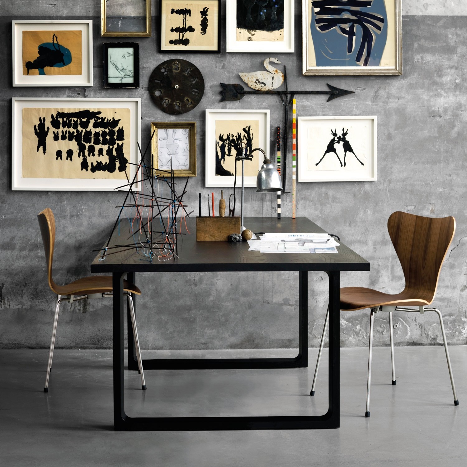
 Here’s an interesting exercise you may want to try. Off the top of your head and without thinking about it too much, write down the names of five iconic office furniture designs. The kind that your Aunt Sheila might recognise if she saw them but wouldn’t necessarily be able to name. When I did this recently while writing a piece about design trends, the products I came up with automatically were things like Frank Lloyd Wright’s desks for the Larkin building, Action Office, the 3107 chair (pictured), and Marcel Breuer’s Wassily Chair.
The striking thing was that the last indisputably iconic product I came up with was the Aeron, and that was launched in 1994. There were some excellent products on the list after that date, but they haven’t become icons and almost certainly never will. It is a characteristic of a true icon that it can communicate with people beyond the trade. Even those people most oblivious or blind to the charms of office furniture design know the 3107 as the Christine Keeler chair.
What is noticeable about each of the products in my own list is that not only are they recognisable to the non-deskhead part of the population, not only have they endured aesthetically, functionally and so commercially over many years, they all have opened doors to a new way of thinking and all reflected something essential about the way the world was changing at the time they were launched. There was often a movement behind them.
In effect they were a response to various forces that created the evolutionary pressures necessary for their birth. So, you would assume that given the extraordinary developments in the way we work over the past few years and the greater knowledge we have that we would have seen the emergence of ideas that were equally seminal and astonishing.
Yet we’ve seen very little in the way of iconic ideas for some time now. We had benching, which was interesting to a large extent and certainly of its time, but never really made it as an icon of design and never will precisely because it is so purely functional. We’ve seen height adjustable desks. We’ve seen a whole generation of pods, booths, rooms and baffles to shut out the din and sight of colleagues. We’ve seen the most amazing dynamic mechanisms applied to chairs, first with a whole array of controls and now more commonly just one or two.
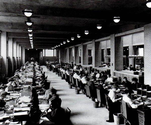
Rows of desks at the Larkin Building, 1905
The best of all of these products are invariably designed to make the best use of modern materials and manufacturing methods and have absorbed new information from diverse fields such as physiology, culture, anthropology and management.
So, what has happened? Ou sont les Aerons d’antan? Why is it that we still feel the need to use Twentieth Century furniture when we want to express certain ideas in office design. In particular we might ponder why the great icons of modernist design from the middle of the century remain so important when we want to convey a specific idea and why the characteristics of their design resonate in more contemporary products.
Some of the answers to this question are perhaps set out in this piece from designer Adrian Stokes which argues that our approach to industrial design is fundamentally wrong, with its overemphasis on a certain type of progress, poor user experience and attitudes to obsolescence and life cycles. He calls for a new movement with clearly defined principles led by the sorts of firms which might do something about it all, including Vitra, themselves the custodians of many mid Twentieth Century icons.
A theme park
One other interesting development that has become apparent is that there is a shift in emphasis from manufacturers about the way products are taken to market. This is evident in the way that collections are not just branded for their individual products, but as part of a cohesive solution. Systems are themed, rather than branded. The themes themselves consist not of one range of products, but a collection of different products, some of which are not what might be considered traditional office furniture and some of which are not office furniture at all.
One of the first firms to present products in this way was Herman Miller with its Living Office concept. The firm has a long history of designing products around a set of principles, notably Action Office in 1968, but that was a manifesto for one system, not a curated solution, which appears to be the way ahead for the 21st Century.
At the giant office furniture show Neocon in June, the world’s largest firm Steelcase presented ideas in a similar way, for example with its Flex collection, which is self-evidently aimed at the agile working and coworking markets. In the UK, Boss Design presents solutions under its Habitats concept. Swedish giant Kinnarps has Next Office.
This move to curate solutions around a theme has also led to a bout of acquisitiveness in the marketplace, as well as greater tie-ups with technology firms, notably Steelcase’s link with Microsoft.
Such developments are very unlikely to produce the sorts of iconic products we will still be leaning on in future decades, but they are a sign of the times.
Mark is the publisher of Workplace Insight, IN magazine, Works magazine and is the European Director of Work&Place journal. He has worked in the office design and management sector for over thirty years as a journalist, marketing professional, editor and consultant.






March 5, 2020
The theme park of modern office design
by Mark Eltringham • Comment, Furniture, Workplace design
The striking thing was that the last indisputably iconic product I came up with was the Aeron, and that was launched in 1994. There were some excellent products on the list after that date, but they haven’t become icons and almost certainly never will. It is a characteristic of a true icon that it can communicate with people beyond the trade. Even those people most oblivious or blind to the charms of office furniture design know the 3107 as the Christine Keeler chair.
What is noticeable about each of the products in my own list is that not only are they recognisable to the non-deskhead part of the population, not only have they endured aesthetically, functionally and so commercially over many years, they all have opened doors to a new way of thinking and all reflected something essential about the way the world was changing at the time they were launched. There was often a movement behind them.
In effect they were a response to various forces that created the evolutionary pressures necessary for their birth. So, you would assume that given the extraordinary developments in the way we work over the past few years and the greater knowledge we have that we would have seen the emergence of ideas that were equally seminal and astonishing.
Yet we’ve seen very little in the way of iconic ideas for some time now. We had benching, which was interesting to a large extent and certainly of its time, but never really made it as an icon of design and never will precisely because it is so purely functional. We’ve seen height adjustable desks. We’ve seen a whole generation of pods, booths, rooms and baffles to shut out the din and sight of colleagues. We’ve seen the most amazing dynamic mechanisms applied to chairs, first with a whole array of controls and now more commonly just one or two.
Rows of desks at the Larkin Building, 1905
The best of all of these products are invariably designed to make the best use of modern materials and manufacturing methods and have absorbed new information from diverse fields such as physiology, culture, anthropology and management.
So, what has happened? Ou sont les Aerons d’antan? Why is it that we still feel the need to use Twentieth Century furniture when we want to express certain ideas in office design. In particular we might ponder why the great icons of modernist design from the middle of the century remain so important when we want to convey a specific idea and why the characteristics of their design resonate in more contemporary products.
Some of the answers to this question are perhaps set out in this piece from designer Adrian Stokes which argues that our approach to industrial design is fundamentally wrong, with its overemphasis on a certain type of progress, poor user experience and attitudes to obsolescence and life cycles. He calls for a new movement with clearly defined principles led by the sorts of firms which might do something about it all, including Vitra, themselves the custodians of many mid Twentieth Century icons.
A theme park
One other interesting development that has become apparent is that there is a shift in emphasis from manufacturers about the way products are taken to market. This is evident in the way that collections are not just branded for their individual products, but as part of a cohesive solution. Systems are themed, rather than branded. The themes themselves consist not of one range of products, but a collection of different products, some of which are not what might be considered traditional office furniture and some of which are not office furniture at all.
One of the first firms to present products in this way was Herman Miller with its Living Office concept. The firm has a long history of designing products around a set of principles, notably Action Office in 1968, but that was a manifesto for one system, not a curated solution, which appears to be the way ahead for the 21st Century.
At the giant office furniture show Neocon in June, the world’s largest firm Steelcase presented ideas in a similar way, for example with its Flex collection, which is self-evidently aimed at the agile working and coworking markets. In the UK, Boss Design presents solutions under its Habitats concept. Swedish giant Kinnarps has Next Office.
This move to curate solutions around a theme has also led to a bout of acquisitiveness in the marketplace, as well as greater tie-ups with technology firms, notably Steelcase’s link with Microsoft.
Such developments are very unlikely to produce the sorts of iconic products we will still be leaning on in future decades, but they are a sign of the times.
Mark is the publisher of Workplace Insight, IN magazine, Works magazine and is the European Director of Work&Place journal. He has worked in the office design and management sector for over thirty years as a journalist, marketing professional, editor and consultant.