April 7, 2014
Can building design presage a fall from grace for the world’s tech giants?
 At the movies, buildings are often used to denote hubris. The ambitions and egos of Charles Foster Kane and Scarface are embodied in the pleasure domes and gilded cages they erect to themselves. Of course, things then invariably go badly wrong. In the real world too, monstrous edifices have often presaged a crash. The UK’s most ambitious and much talked about office building at the turn of the Millennium was British Airways’ Waterside, completed in 1998, just a year after Margaret Thatcher famously objected to the firm’s new modern tailfin designs by draping them with a hankie and three years before BA had to drop its ‘World’s Favourite Airline’ strapline because by then it was Lufthansa. Nowadays BA isn’t even the UK’s favourite airline, but Waterside remains a symbol of its era, albeit one that continues to influence the way we design offices.
There are other examples throughout history of buildings that became synonymous with a crash. The Singer Building in New York was completed in 1908 following The Panic of 1907, The Empire State Building opened in 1931 at the height of the Great depression, Dubai’s supertall Burj Khlaifa became synonymous with the Emirate’s financial woe and the Petronas Towers in Malaysia threw open their doors a year ahead of the 1997 Asian financial crisis which saw economies suffer and currencies crash across the region.
Such associations invite people to draw conclusions. One of them was an analyst at Dresdner Kleinwort Wasserstein called Andrew Lawrence who in 1999 came up with a half-joking theory based on a paper he’d written called Faulty Towers, which sought to establish a link between economic vitality and people’s willingness to build towers. You can buy into this theory or not, but it’s probably true that the cyclical nature of economies, the willingness of firms to become more ostentatious when things are swinging along and the time it takes to get a skyscraper from idea to open, means that some congruence of ribbon-cutting and financial bust is inevitable.
It’s also possible that such buildings are only developed for firms that are at the height of their powers. It was certainly the case with British Airways and history teaches us that firms rise and fall all the time.
Which rather begs the question what will become of the generation of Tech Palaces that have been in the news so much over the past couple of years? Does their building design signify anything? In an industry in which only a handful of bad products (or even just one) can spell disaster, will the new corporate edifices of Google, Facebook and Apple be seen in retrospect as the symbols of the end?
If you subscribe to the theory that architecture and design are dead giveaways for how a firm sees itself, there is much to chew over in each of the three most high profile tech buildings. One of the most interesting is how each deals with the wary relationship tech companies have with the idea of ostentation.
None have opted for skyscrapers. Even a building in the centre of one of the world’s most expensive cities, Google’s massive and new Kings Cross development, is relatively low level. Partly this is for practical reasons. As the author Greg Lindsay explained in an interview with us last year, the floors of a building bring their own problems, not least in terms of collaboration. Even so, the press announcement that was issued with the plans compared the floor space offered by the new building with that of the more obviously phallic Shard. Size is obviously important, just don’t draw too much attention to it.
The Facebook building at Menlo Park in California betrays the same ambiguous relationship with displays of corporate wealth and power. The building itself is low key and designed to sit comfortably in its surroundings, but then again it does inhabit a 22 acre campus site for 3,4000 employees and was designed by Frank Gehry. But what else would you expect from a company whose founder is invariably pictured in t-shorts and jeans, is seemingly wary of conspicuous consumption, draws a salary of $1 but who is also worth an estimated $25 billion?
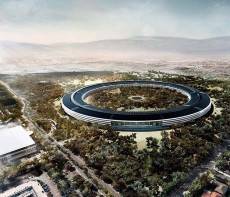
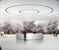
Apple have also opted for a campus building in California but this one of very different. It has something of the lair about it. The design by Foster and Partners certainly comes across as appropriate for a firm with Apple’ s attitude towards design, and it shares none of the outward focus and bio-awareness of Facebook’s site. Instead it is self-contained, slickly futuristic and secure, with a central building that has much in common with Britain’s GCHQ doughnut. It is perhaps more of a compound than a campus.
The question such buildings beg is whether they do display some form of hubris in the attitudes of the firms that will inhabit them. They are not likely to be completed to coincide with another economic crash but they may coincide with a downturn in the fortunes of each of the firms.









April 11, 2014 @ 1:22 pm
https://www.co-operative.jobs/head-office/our-future/our-new-head-office/
QED