September 13, 2013
100% Design: Holding a mirror up to the way we design and manage workplaces
If art holds a mirror up to nature, shouldn’t the design of workplace products hold a mirror up to the way we work? By definition, the things with which we surround ourselves should tell us something about the way we see ourselves and what we do. It should be possible to infer from the design of the products suppliers offer to the market what is changing in the workplace. This isn’t always the case, of course, especially for those firms who see design not so much in terms of putting lipstick on a gorilla as telling you that what you’re looking at isn’t in fact a gorilla at all. It’s Scarlett Johansson.
The opportunity with shows like 100% Design, which takes place at Earl’s Court next week as part of the London Design Festival, is for office specifiers, designers and buyers to come together not only to see the latest products from some of the world’s most progressive suppliers of office (and domestic, retail and hospitality) products but also get a sense of their customers’ concerns.
Office furniture used to be about hard, mechanistic, business-y matters. Desks were about space efficiency, by which was meant how much worksurface you could fit into the footprint of a workstation to accommodate huge computers, masses of paper and a display of raw status. Chairs were about meeting ergonomics regulations so the firm wouldn’t get sued by employees. Storage was about how much paper you could file in as small a space as possible.
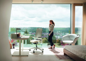
While those things are still relevant to a large degree, they don’t get talked about half as much anymore. Office product design these days is about human factors like acoustics, productivity, comfort, interactions, colour and collaboration. The most talked about business issues are those plus the environment, flexible working and culture.
So when you visit a show like 100% Design, as well as checking out individual products, it’s possible to explore the themes of the event. Like most events dedicated to workplace design, you won’t see many desks. It’s not that people don’t work at them anymore, more that the modern desk is often essentially a table. The interesting stuff is going on around it.
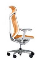
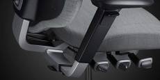
In terms of ergonomics, the best new products no longer talk about posture as they once did, but about movement. That is true for two new task chairs debuting at the show this year. Sabrina from Japanese firm Okamura claims to use a patented ring-shaped backrest that flexes to fit your body and gently twists to either side for extra comfort. Meanwhile the new Mereo range from RH Chairs uses the firm’s patented mechanism to encourage what it calls active sitting.
One of the most talked about issues at events over the last few years has been acoustics. We can speculate about the reasons for this but my guess would be shrinking space standards, less personal space and the incessant background yap of other people encouraged by mobile devices and the insidious feeling that we should all be talking to somebody all the time.
The problem with acoustics is that it’s not as easy to solve as just throwing screens and partitions up between people who you assume don’t want to see or hear each otherand even if it were, isolation isn’t always such a great idea either. It needs some knowledge of the dynamics of sound and sightlines in an office to come up with something that is well balanced and sophisticated and takes account of the building and the culture of the organisation.
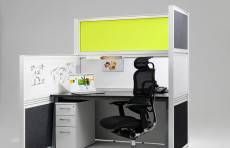
That is why companies like Icon have adopted a consultative approach as well as developing a wider range of products that use materials and design in new ways to address the issues related to workplace acoustics. These include System 06, which can be used to create cubicles. I know we’re all supposed to have given up on these in our post Dilbert world but they are making a reappearance for precisely the same reason they appeared in the first place – because they serve a human need.
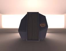
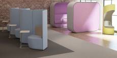
Other manifestations of the new generation of cubicles include the CalmSpace from Haworth which looks like a photobooth or possibly one of the matter transfer pods from The Fly but is in fact a ‘nap capsule’ in the words of the manufacturers. Meanwhile Oof Design led by RCA graduate George Liarikos is showcasing its acoustic booths. Boss Design is going the whole hog and introducing a range of pods, booths and screens aimed at providing people with some seclusion at work.
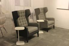
Acoustics even plays a role in some new seating designs, including the new Grainger range from Allermuir, a breakout/hospitality seat which incorporates a winged headrest. The other notable feature of this chair is its retro styling and the domesticity, or possibly hotel-icity, of its design. The fact that it is hard to pigeonhole this as a chair solely for the office market is a sign of the changing nature of work. Many workplaces, or parts of them at least, have adopted the aesthetic and functionality of hotels, lounges and even homes and the furniture is following suit. That is true for ranges on show such as Octo (also from Allermuir), Mimic from Kinnarps and Opt4 from KI.
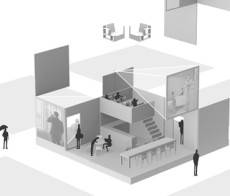
One final feature to look out for is the Hanging Room by designers TILT (who have also come up with an interesting range of organically shaped furniture and an acoustic pod). This is a new take on the idea of an office with task-based zones for working but this time with hanging wall partitions that descend and change the nature of the space below.








The rehabilitation of the cubicle and other lessons from 100% Design
September 20, 2013 @ 12:13 pm
[…] of the third space products on show were covered in our preview of the show but some interesting additions we saw at 100% Design included breakout chairs from a […]