January 10, 2017
A unity of opposites at Sky Central 0
 It’s drummed into us from an early age that we can’t have it all, as a result we consider choices as being a binary either/or situation. The workplace design brief (where it’s actually undertaken, an entirely separate discussion) positions choices similarly – open or closed, focussed or collaborative, modern or traditional – the decision point existing along a sliding scale from one natural extreme to the other. Yet there is a way to consider workplace design as an attempt to achieve the “unity of opposites”, an idea proposed by the pre-Socratic aphoristic philosopher, Heraclitus, the original thinker on change. This holds that the existence of an idea is entirely dependent on the existence of its opposite, that one cannot exist without the other. The framework is considered here in its application to the recently completed Sky Central in Osterley (West London), a newly constructed 38,000m2 NIA activity-based workplace over three floors that is home to 3,500 of the total 7,500 people on the Campus. It may be considered as tool for aiding workplace brief development, or for understanding how a workplace has been conceived and functions.
The Osterley Campus has undergone considerable change since the completion of the new Sky Studios building in 2011. This has been underpinned by a move in Osterley – and a number of other locations throughout the UK and Europe – to an activity-based workplace for its corporate employees together with a recognition of the need to provide suitable space for its Agile (in the established sense, relating to software engineering and not to be confused with “agile” when applied to a flexible workspace) teams within striking architectural creations, knitted together by an extensive landscaping programme. Sky Central is the latest building to be completed on the Campus, fully occupied during July and August of this year. Over 3,000 of the new occupants had previously been assigned their own desk or private office in ageing, mainly leased stock and so the move represented a significant change of environment. Sky consider the workplace, designed by HASSELL and Arup as an investment in its people, a key enabler to them undertaking the best work of their careers.
This is how Sky Central unifies a host of opposites. The labels may not immediately appear to be antonyms, yet the premise in each instance will reveal itself.
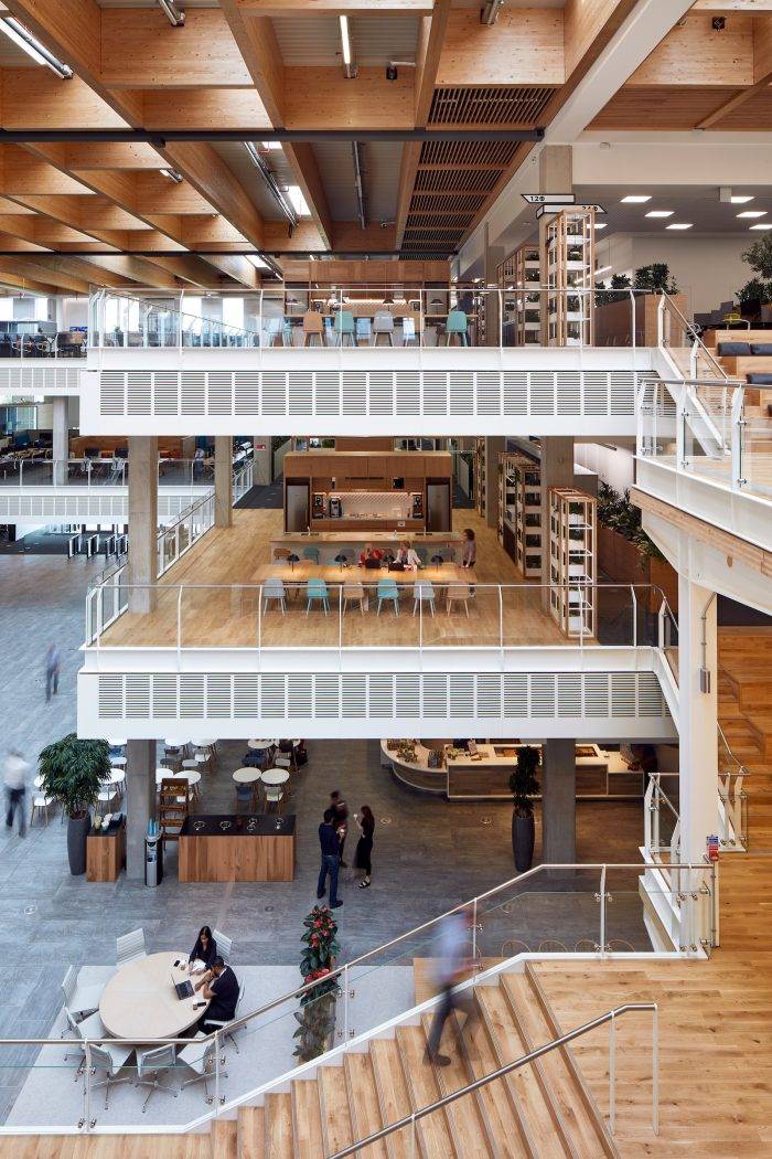 BEAUTIFUL – and WORKS. The form versus function debate is rarely far from the lips of an excluded FM disgruntled at the management burden imposed by architectural choices. However a building can be both beautiful and functionally efficient. Sky Central’s vast voids are criss-crossed by multiple staircases and ramps that offer countless vistas, journeys and moments in which to pause and absorb its scale. Yet from its systems to technological infrastructure, its eighteen neighbourhoods supporting around two hundred people each in keeping with “Dunbar’s number” of ideal community size, the “20m rule” akin to the ideal of Bürolandscaft whereby a break in sight lines, some solid some permeable, is set up to twenty metres from wherever you stand that brings intimacy and a human dimension, it works beautifully,. This is best illustrated by the presence of the huge glass box cantilevered over the main street that is the new Sky News studio, bringing content into the heart of the building.
CREATED – and GROWN: There is no question that a structure measuring 163 metres long, 10 metres wide and 25 metres tall – that rolled into a typical CBD towerblock would reach thirty one stories in height – has been constructed, as over three million labour hours across two years will testify. Yet the rich external landscaping with over 250 new mature planted trees (the precise number not concluded as the programme continues) and the present tally of 24,776 plants installed within the building, along with over 8km of glulam beams in the roof structure allude to an intrinsic connection between the inside and the outside, a space that exists in Gilles Deleuze’s “fold”. In this complex idea, in a universe that exists through the infinite folding to complexity, growth itself is a process of unfolding, of revealing. If we think of our buildings as needing to appear in as many instances as possible as grown, rooted, nurtured, we may at last overcome such commercially manipulated ideas as biophilia and start to genuinely embrace connectedness.
WORKPLACE – and CATEGORY: In many respects the brand that is the “workplace” has taken a battering in recent years, able to satisfy no-one in its lurching from panacea to panacea. In response it has tried to position itself as anything but – it’s a club, a hive a home from home, a hotel, a retail outlet, a café – anything other than owning up the reason it’s here, anything that adds a dab of credibility. It’s yet another in a sea of identity crises. Yet when a workplace starts from the premise that a workplace is exactly what it is, it sheds a huge burden of expectation. From this point it can mash-up the contribution of those purposes as needed or appropriate, in creating a category of its own. If the blend is unique, it can be both workplace and [category]. The category here is the thing itself, not yet named. Sky Central draws on multiple influences, blending and blurring them, but still manages to look and feel like a workplace and support work in all of the expected ways, yet also those less expected.
PEOPLE – and DNA: It’s an oft-heard refrain that space is “all about people”. It begs the question as to why it wouldn’t be, or hasn’t been. More than occasionally, the desire to stamp a branded identity on a space to an inhuman degree takes control of the design outcome. Occupants know who they work for, visitors know where they’ve landed. While occupants generally like to feel that their space characterises the organisation they work for, there is a balance to be struck. While Sky Central has been created for comfort, ease, simplicity and choice, it still attempts to capture the essence of the business in order to create a sense of belonging – openness, egalitarianism, and most of all a sense of possibility. It is what Kornberger and Clegg (2004) would call a “generative building”, in that it is not merely a passive container for events but an active contributor to organisational activity. It’s a subtle weave, and hard to achieve.
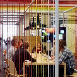
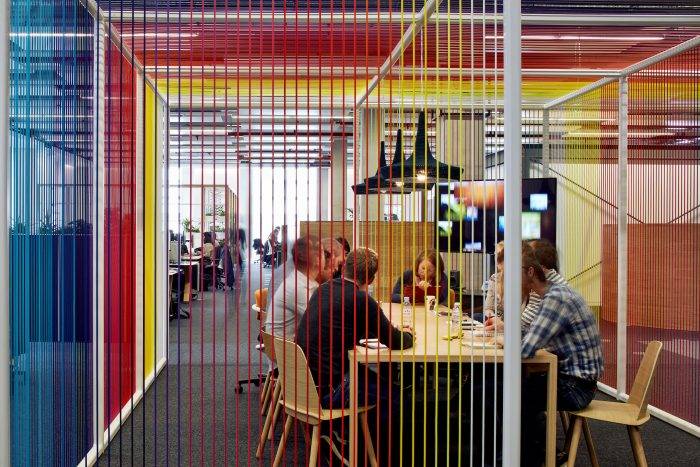
TIMELESS – and PLAYFUL: How does a scheme extract itself from a scale tipped at one end by the slides and climbing walls of the net generation and at the other by the creak of Italian leather and “don’t-touch” art collection of the legal profession? Sky Central aimed to be an adult space, applying natural materials in a modern way, and avoiding the ephemeral rush of gimmickry. Creating a playful spirit in a space is part design, part participation – from adding texture and tactile elements like the “rope house” meeting spaces, to making use of amenities like the 200-seat digital cinema for gatherings, events and film premieres, encouraging good neighbourliness through community events based around features naturally lending themselves to such like the Home Zones, and popping up showcase and promotional opportunities in public spaces like the Street.
CALCULATED – and INTUITIVE: Counter-intuitively, it takes a complex spreadsheet and calculation to create a space that is as intuitive and accessible as possible. Activity-based working isn’t about setting out a smorgasbord of furniture types till it resembles a dealer showroom, it’s a considered process of defining work activities, desired outcomes, building blocks and proportions. To accommodate its 3,500 people Sky Central has roughly 5,000 places to sit across all space types, of which 2,500 are “desks”, identifiable by virtue of their 27-inch monitor, single-USB docking station and peripherals. The spectrum of space types from the most focussed and quiet to the most interactive is as seamless as possible. There are six different forms of desk in a variety of finishes, in a deliberate push away from the serried white desks disappearing into oblivion that have characterised large corporate workspaces for a decade or more. All of this to create an environment that is simple, accessible, and non-prescriptive – soft visual clues hint at intended purpose, but “guerrilla architects” are welcome to re-define usage as suits, all within the spirit of good neighbourliness. The process of working with a “minimum unit of planning” (MUP) for each group in the building of a hundred people – instead of drilling down to the smallest non-divisible team – effectively handed space to the building’s occupants to use as they wish, and ensured everyone had access to the widest variety of space types in an area.
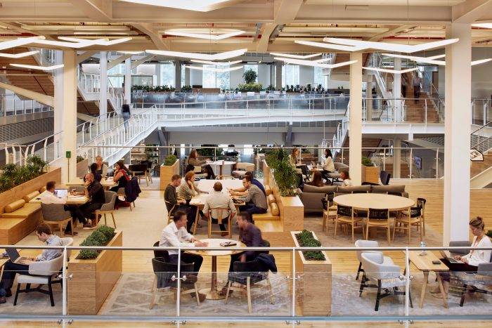 TECHNOLOGICAL – and ANALOGUE: Two awkward assertions hold true that still have not entirely sunk in within the world of workplace. Firstly get the technology right before doing anything else. With highly flexible, super-connected tech, a terrible physical space can still work – but with poor tech, investment in an amazing space is likely to be wasted. Investment in tech should be the first, and most protected, item in the budget. It can also be rolled out before the project even begins, its dependency relates only to building infrastructure. Secondly, the more technology a team works with, the more analogue space and features it needs. Agile engineers crave whiteboards for Big Visible Charts (initial caps intended) for regular stand-ups and work tracking, covered in sticky notes. Sky Central has a technical infrastructure comprising Cat 6 flood cabling and wifi, along with a simple plug-and-play desktop previously described, telephony via Skype for Business, follow-me printing, VC and telepresence rooms and viewing stations decked with Sky and competitor products allowing EPG access. It also has a genius lounge, Tech Central, that operates as a drop-in IT helpdesk to avoid the need to make a call and (deep breath) “log a job”. Within the physical space, there are “global destinations” such as two atria and two mezzanines with a range of formal and informal meeting furniture, and alternative settings arranged as organically as possible with the desking for ease of access. The technology is there when you need it, and respite is there when you need it to.
NOW – and THEN: A workspace needs to support work the way it is performed today – and the way it might be performed in future, which as of today is unknown. It therefore on the one hand needs to be based on evidence, where the form of the building follows the function it is intended to support – and on the other hand be able to offer and stimulate opportunity for work to be performed in different ways, as individuals and teams develop and change, where the function of the people follows the form of the building and space. If either is stressed too greatly, either the present or future will suffer. Given the open ended nature of opportunity-based design, the need for tummelers is paramount. The word and idea originates from the German tummeln, which means ‘to stir’. That is, people doing things differently and talking about doing things differently. The Change Leads appointed from within the business performed a significant role in this regard – more on this later in the paper. Finally, Sky also avoided the use of a misnomer to try and describe the type of space or reference an intended activity, no “smartworking” here. In the first flexible space on Campus launched in 2014, the Hub, an architecturally striking space for 525 people, the term “Sky Space” was developed on which to hang the new ideas, but after its launch the term, the materials the animated film, were all let go. The space being created spoke for itself.
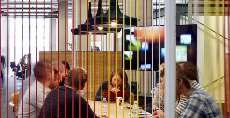
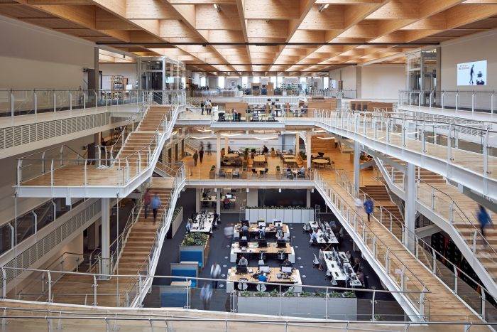 TOGETHER – and ALONE: The misconception of “open plan” that has perpetrated a sustained journalistic assault is often supported with evidence that the panacea that would drive interaction and productivity is a myth, and that the reverse occurs. The Gensler surveys have consistently reinforced the notion that we spend roughly half our time in focussed activities and half in interactive. With this in mind, an aim of Sky Central was a balance between spaces that would allow both, while maintaining a connection with the space at all times: spaces in which to work together, and spaces in which to work, think, meander and lose oneself, alone. It also works on the premise that when working alone it is less a problem of noise – a background hum can be highly beneficial when focussing – and more about sending a signal to avoid disturbance, the “have you got 30 seconds?” that becomes half an hour. In this way it is supporting the subjective and objective views of productivity.
SUSTAINABLE – and BOLD: It is often held that a sustainable building is “safe” not just in terms of looking after its occupants, but also in offering little to challenge us. Sky Central achieves BREEAM Excellent, as would probably be expected, its PV cells generate 10% of its electricity needs, the rainwater it harvests feeds its washrooms, the extensive planting oxygenates the atmosphere and the Live Well food programme protects waistlines. Yet the decision to build one large space was bold, counter to market expectations and the conventional wisdom of a series of smaller, vanilla buildings. It has little do with Facebook’s 430,000 ft2 floorplate and more to do with how Sky wanted its people to work – openly, transparently. Perhaps without the courage of these decisions I wouldn’t be writing about the building at all.
STANDARD – and BESPOKE: Sky didn’t do things differently for its own sake. Experimentation and uniqueness was never an aim. Sky partnered with established firms in design and construction, and in its workplace fit out like Herman Miller. It got to know and work with partners whose presence was less established, such as Koleksiyon, whose decking brings a domestic, relaxed feel. It developed products, the basis of which was there but the exact response not quite what was needed, like Orangebox, Vitra and Ergonom. And it worked with suppliers with no presence in the UK, like Massiv with its Craftwand sustainable timer divides. Joinery was used where the market couldn’t meet the needs of the scale of the building. Overall it was a balanced response, and all within a cost management that took a third out of the initial cost plan by the time the fit-out was complete.
 SUGGESTED – and OWNED: Sky were about to move over 3,000 people assigned their own desk or office to an activity-based workplace. It was a conscious decision to own the change programme itself without any investment in consultants, more specifically to ensure that people moving to the space owned it. Based around the Living Lab – a constructed slice of Sky Central created in its old gymnasium in a building now being demolished to make way for a car park – and a web portal, it trained sixty Change Leads to carry the conversation with the occupants. Sky’s lexicon was grown up, the soft-handed approach was flexible and allowed enough room to weave in messaging as required, based on an open and lucid dialogue. There was no etiquette training or prescriptive messaging, rather the conversation was based on simple sense and good neighbourliness. The project team facilitated, but did not arbitrate. In gifting the workspace to our colleagues, the project team offered suggestions as to how to use it, but left the decisions up to the occupants. It has always been their worksplace: by creating as much choice as possible in the use of the space, our colleagues now own the opportunities it presents.
LEARNED – and LEARNING: Learned implies a static position, with enough gathered to begin. Learning is an active process, assuming little and taking on board a lot. Without the experience of the Hub two years earlier, and the learning that resulted, it is unlikely Sky Central would have been anywhere near as successful. It is where we pondered the need for MUP’s, where we determined we needed a greater range of desks, a more organic layout, and a deeper conversation. From here, Sky Central presents a highly significant learning opportunity for Sky, and for the Workplace profession. Utilisation studies, system information, focus groups and a post-occupancy survey will provide a rich data set by mid-November that will inform immediate and longer term changes needed, and inform future Workplace projects. Moreover, the conversation will continue – the change programme lives on, a project footing has been maintained. There are still 3,000 colleagues to move between other Campus buildings by Easter 2017.
THE END – and BEGINNING: As it relates to Sky Central, the research, benchmarking, design, planning, installation and relocation is done. The formal end of a project is often difficult to determine, it often resembles a river delta flowing into the sea. There were times where everyone closely associated with the project wanted to step off the belt – the journey was convoluted, tangents were taken and abandoned, ideas were tested and rejected, the elastic limits of patience exceeded. Yet the collective belief never buckled. At this point, the journey for our colleagues is just beginning. Some have lifted and shifted old ways, some are changing slowly, others have leapt willingly into a new world of work. As a team our learning journey is underway, as we talk, watch, listen, survey and understand. There will be surprises…..all is flux, after all.
Sky Central is not offered as a panacea, a blueprint for others, it just happens to be right for the organisation. Neither is the “unity of opposites” model a way in which we should always think about our workplaces, yet it may help. It brings us to the final unity of opposites, the pre-socratic and postmodern – Heraclitus, sage of change and Delueze, contemplator of art and philosophy, one living in a world with very little architecture, one in a world saturated by it, yet both with vital thoughts that help us understand it. I hope they would both have approved.
_______________________________
 Neil Usher is Workplace Director at Sky. This article is the main feature in the Winter 2016 issue of Work&Place. The PDF edition is available to view and download here. Or view online here. All images ©Mark Cocksedge. Design by HASSELL

