About Paul Goodchild

Posts by Paul Goodchild:

From the archive: How organic design can reflect the way people move around a building

From the archive: How organic design can reflect the way people move around a building

organic designThe story goes that, after Rem Koolhaas had been appointed to design the McCormick Tribune Campus Center at the Illinois Institute of Technology in 2003, the legendary architect noticed how students had created their own pathways between the buildings on the site. The site of the new building included a field on which their footprints had worn down the grass to such an extent that distinct grooves had been carved out that reflected their movements, prompting him to consider the effect of desire lines on organic design.

More →

Coworking disrupts office design

Coworking disrupts office design 0

In his book How Buildings Learn, the author Stewart Brand outlines the process whereby buildings evolve over time to meet the changing needs of their occupants. He describes each building as consisting of six layers, each of which functions on a different timescale. These range from the site itself which has a life cycle measured in centuries, through to the building (decades), interior fit out (years), technology (months), to stuff (days). The effectiveness of a design will depend on how well it resolves the tensions that exist between these layers of the building, and this is one of the benefits of coworking that isn’t discussed enough.

More →

Adversity and chaos can help to foster creativity

Adversity and chaos can help to foster creativity 0

Senecio by Paul Klee who had some interesting things to say about creativityWe may live in a knowledge economy in a world, where the most highly-prized people as far as employers are concerned are knowledge workers, but the thing that sets us apart from the machines is not knowledge at all, but creativity. Acquiring managing and sharing knowledge is essential, but it’s what we do with it that really matters. So it’s no surprise that creativity has become the de facto Holy Grail for many modern businesses.

More →

How do we reach consensus about what constitutes good design?

How do we reach consensus about what constitutes good design? 0

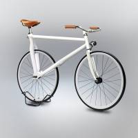
Gianluca_Gimini-Velocipedia-5In shows and the media, we are often invited to pass judgement on products and ideas that have been created by other people. The reviews that follow often cement some form of accepted view, even if we often outsource the decision making to people who are better placed to decide, or at least better enabled to express an opinion. Such judgements would not function at all in this regard unless there was some underlying consensus about what constitutes good and bad design at the same time that we all believed we know what good taste is and we all know a good piece of design when we see it. In so far as the consensus is universally accepted, we are all right. But how much do we really understand about the things that surround us and their design? And how meaningful is the consensus? In JG Ballard’s novel High Rise, recently made into a film, he writes of the disdain Anthony Royal, the architect of the eponymous tower has for the tastes of its residents.

More →

Getting a better handle on the psychology of office design

Getting a better handle on the psychology of office design

It was the Finnish architect Juhani Pallasmaa who described the door handle as ‘the handshake of the building’ in his book The Eyes of the Skin: Architecture and the Senses. Buildings greet us in other ways too and we respond to those greetings in very human ways. So much so, in fact, that when we make decisions about the ways in which offices introduce themselves, we should take account of the psychological factors that can mean the difference between a successful or failed office design.  More →

Don’t stand so close to me: why personal space matters in the workplace

Don’t stand so close to me: why personal space matters in the workplace 0

As successive BCO Specification Guides and the research of organisations like CoreNet Global have proved, the spatial dynamics of offices have changed dramatically in recent years. Put simply, the modern office serves significantly more people per square foot than ever before. Originally this tightening was largely down to the growing ubiquity of flat screen and the mobile devices, but more recently the major driver of change appears to be the gradual disappearance of personal workstations in favour of more shared space.

More →

Convergence of work and life defines September London workplace design shows

Convergence of work and life defines September London workplace design shows

It has always been a characteristic of the 100% Design exhibition that it has segmented along the demarcations of workplace, home, interiors, kitchens and bedrooms. This used to make perfect sense as the same distinctions existed in our lives, reflected in the form and function of the products we allocated to those spaces. This is no longer the case to anywhere like the same extent and consequently, the workplace section of the show is full of products that could make the crossover into a domestic, cafe or hotel setting with not an eyebrow raised. That is not to say that the mainstay products of the workplace – desks, task chairs, storage, screens – are no more. They are still specified in vast numbers. It is just that the interesting aspects of workplace design are to be found in its shared and public spaces. It is here where we witness the convergence that characterises modern working life. We might still talk about work life balance (too much) but there is a growing realisation that the distinction grows more meaningless with each passing year.

More →

Settings and serendipity define workplace design at Clerkenwell Design Week

Settings and serendipity define workplace design at Clerkenwell Design Week 0

Because a vast show like Clerkenwell Design Week is about as easy to digest as a whale omelette, visitors often find themselves discussing with other people what is worth seeing and, perhaps more importantly, what they think its themes are. At this year’s show, the fine weather meant it was possible for people to occupy the pavements with a drink and share a general feeling that in terms of workplace design, there were few, if any, standout products and that most of the themes were now pretty well understood.

There was a great deal of talk about the need for privacy, the creation of a choice of settings in which to work, the influence of the coworking movement, wellbeing, agile working, Millennials, the intersection of design idioms from the domestic and commercial worlds and planned serendipity. These are now familiar subjects and, with the exception of a largely false narrative about Millennials, all in tune with the main concerns of occupiers and employees. They may be familiar but we should celebrate the fact that this in itself signifies not only growing sophistication in the demands of buyers but also the way we address workplace issues as a sector. Most tellingly, there is one common factor at the heart of each of the concerns addressed in the designs on show; people.

This marks a profound shift from the old hierarchical constraints that used to define office design. The idea that a building should be carved up and shared out semi-permanently between individuals based on their job and status for set periods of time now looks more and more archaic as each day passes. The modern workplace can be pretty much anything it wants to be and we should not take that for granted just because it’s been said before.

Boss Design

Boss Design

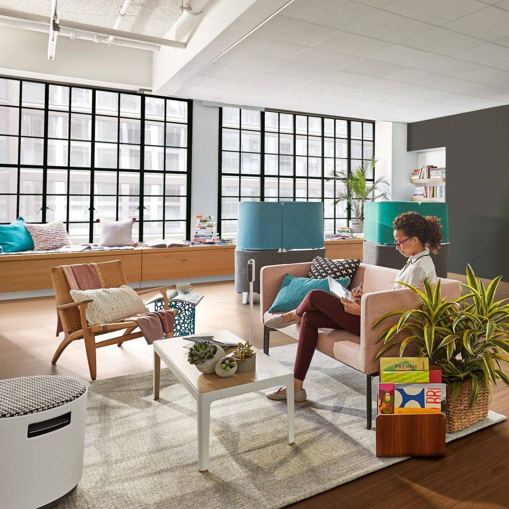
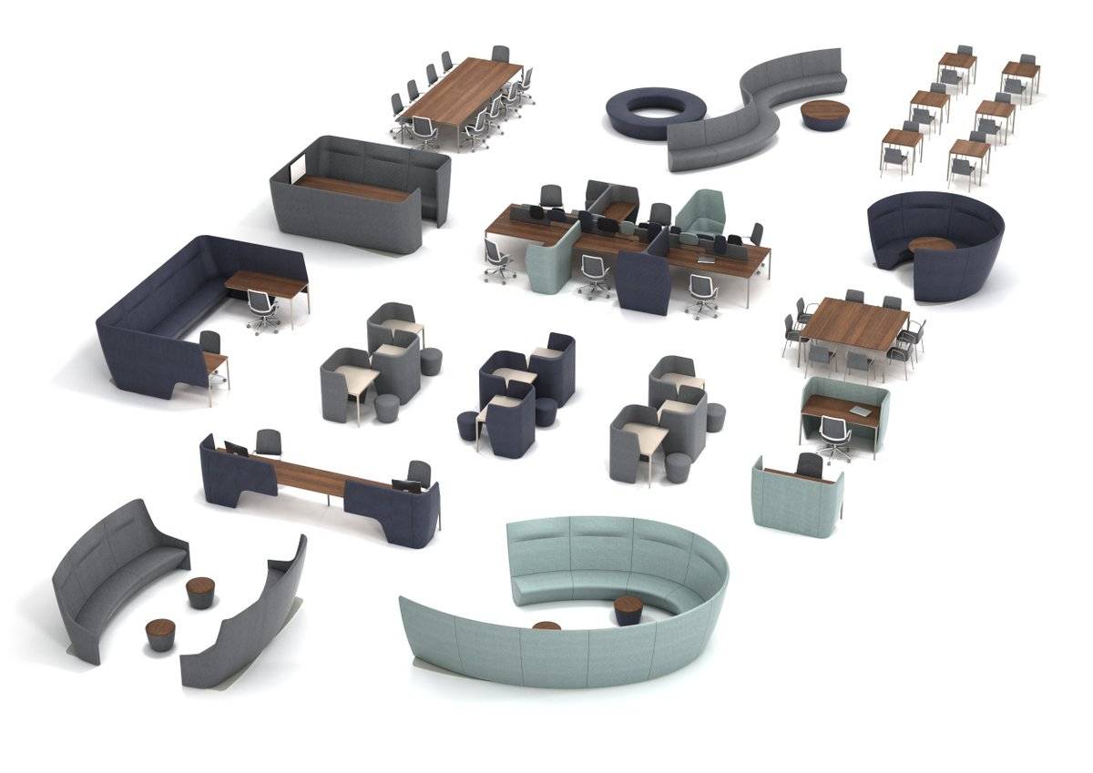
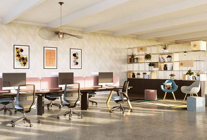
Encapsulating these ideas was a brand new range from Boss Design called Atom designed by Simon Pengelly. The business model of Boss has always meant it found itself at the intersection of various forms of design with a portfolio of products that could be used in a variety of settings, but Atom offers a fully resolved menu of elements that make the idea explicit.

Where once modularity in furniture design meant that parts fixed and tessellated, it now refers to a more freeform interpretation. This isn’t Lego modularity but something more organic, ingredients rather than parts.

The designs are very much focussed on people. These are the sorts of products that invite people to work in the ways that suit them best. Designers and office buyers are given the elements needed to offer employees choices but without any sense that solutions are prescriptive. As Simon Pengelly explained, it’s all very well having collaborative space but it only works if you’ve then got a space to do something with the ideas you’ve just shared. This was the best resolved system of products at the show and one very finely attuned to 21st Century office life.

Boss Design


Steelcase

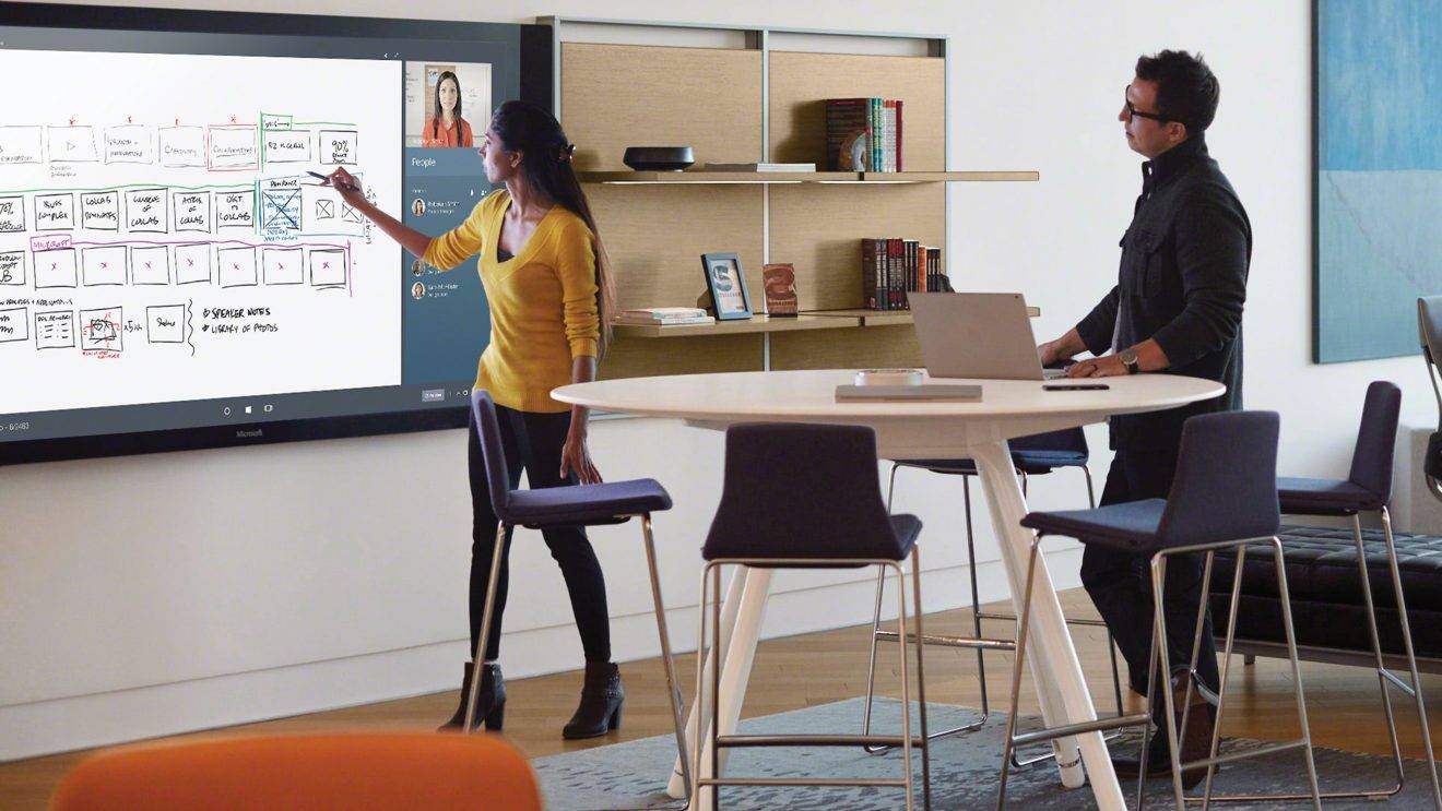
The world’s largest office furniture manufacturer was pursuing similar themes while also sharing the stage with Microsoft, a firm with which it has just announced a global partnership agreement, focussed in large part on the forthcoming Surface Hub, previews of which were available at the event. The main focus of the firms’ approach was how work settings can be integrated with technology to produce working environments that foster creativity. In the accompanying presentation, we were told not only that this will be the main focus of office design in the coming years as machines take on most of our process driven work, but also that if office furniture firms want to survive the century, they’ll need to be talking about far more than office furniture which is perfectly true and equally applies to the whole workplace sector. This is not a time for one trick ponies.

Appropriately Steelcase offered up a number of settings to give people the chance to work creatively including a Respite Room. Offices may exist to bring people together but we always need time away from them.

Steelcase (and top)


Connection

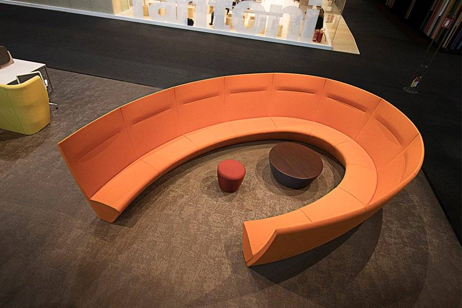
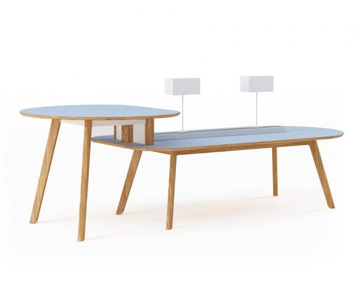
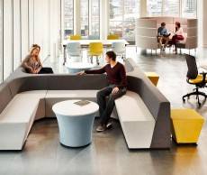
Connection was one firm that made the link between wellbeing and domestic and commercial design explicit with a soft seating system called Hygge. This is a reference to the modish Scandinavian practice of hygge, which cleverly taps into our ongoing fixation with all things Nordic and our belief that they have a unique insight into how to achieve a work life balance and look after themselves. The firm was also on point with its new co.table which again expresses the overlap between domestic and commercial design as well as the increasing adoption of agile working models. Connection was also addressing the issue of acoustics and privacy with its elegant system of rooms, now a well-established requirement for shared spaces.

Connection


Spacestor

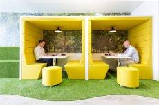
Another firm characterising the intersection of domestic and commercial design as well as the creation of room settings, Spacestor launched their new Palisades room divider system. Not screens but the sort of dividers used to break up space, as well as store and display objects. Spacestor were also showing their work pods, including options defined as railway carriage and phone booth.

Spacestor


Sit/stand workstations

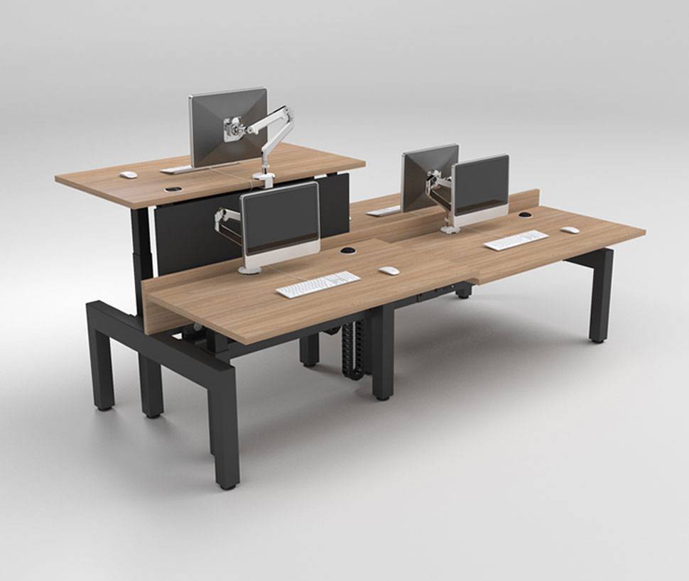
Now almost as ubiquitous as the bench desk, sit/stand workstations have become mainstream in the UK as they have been for quite some time in parts of Scandinavia. In part this is down to the medicalisation of sitting down as a result of some well thought out but – in my view – slightly off the point PR. But it is also a signifier that firms are interested in the wellbeing of their staff, an issue about which it is impossible to be cynical.

So Staverton, Humanscale and others had nice products on show, but it is evident that as is true with bench desks (and toilets, come to that), the product itself exists in pretty much its purest form as it is. It is a worksurface with an actuator to make it rise and fall. It’s a good product, but one which you can hardly expect to see evolve.

Staverton


Task seating

Conversely, the design of task chairs has actually returned to a simpler form. Over the past 20 or more years, there had been a race to see who could offer users the most adjustments. So, where once the chair merely went up and down and rocked, every part of it had to be adjustable in at least one dimension and preferably three. An arms race, if you will. The result was a proliferation of controls around and underneath the seat.

Over the past few years, we have seen a reversal of this in favour of something more intuitive. Typical of this new generation of chairs are the se:joy from Sedus, Trinetic from Boss Design, various designs from Humanscale (who, it could be said, catalysed the development of chairs that work with the body rather than an instruction manual) and, new this year, the EVA chair from Orangebox which claims that by ‘refining the chair to just a few controls has allowed us to focus on maximising the range of adjustment it offers’. Counter-intuitive maybe but they’re right.

Orangebox


Flooring

Innovation in carpet design tends to come about as a result of the interrelationship of new materials and manufacturing technology and the designs each manufacturer can derive from them. There are some great products on the market, and each one has a separate narrative woven around it, if you’ll forgive the pun. These can range from the use of colour and trends forecasting, to environmental concerns, the crafts movement, biophilia and printing techniques.

In typical fashion, the major flooring showrooms at Clerkenwell Design Week had lively events programmes that highlighted trends in the market and are perhaps somewhat less product focussed than furniture showrooms. So, Interface focussed on the positive effects that design can have on people, Milliken hosted a series of events including a Design in Education debate with Jay Osgerby and Annie Warburton and Shaw Contract hosted several CPD accredited talks including one rejoicing in the title “Using virtual reality as a participatory approach for evolving spaces in our cities”.

Porcelanosa


Socialising

And, of course an event like Clerkenwell Design Week would be nothing without the chance to have a drink and a chat with friends and colleagues. The event this year was blessed with blue skies and temperatures in the high twenties, which is a mixed blessing if you’re hosting parties at one of the showrooms. Despite concerns that the warm weather would mean people swapping bars for studios, all the events seemed incredibly well attended, including those at Vitra and KI.

This is, of course one of the main aims of such exhibitions, to bring an industry together as one and with one voice, at least this year with regard to the aims and concerns of workplace occupiers and the people who work for them. In all senses, an event about people.

_________________________________

Paul Goodchild is the Design Director of Fresh Workspace.

The people centric urge to personalise space helps firms to engage employees

The people centric urge to personalise space helps firms to engage employees 0

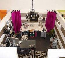
a97998_cubicle_5In America at least, the great symbol of corporate conformity is the office cubicle. Satirised in the Dilbert cartoons and a staple in any movie about the degrading aspects of modern working life, the cubicle provides a perfect shorthand way of portraying an individual crushed by the corporate jackboot. Yet what these things miss is the propensity of people to personalise their surroundings and claim a space as their own, even if only for the short time they may be there. This seems to be particularly the case when it comes to office design and so we were much taken with this blog which lists the most far out and quirky ways people in the US have found to personalise their cubicles. Of course the need and urge to personalise space are not limited to the US. We often find in the course of our own installations that the first thing people do when they occupy an office for the first time is to personalise their space.
More →

What our enduring love of wooden office furniture tells us about how we work

What our enduring love of wooden office furniture tells us about how we work

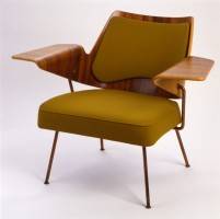
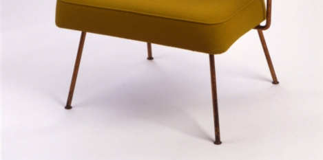
Robin Day Office FurnitureAs the office continues to evolve so too do the materials used within it. While many corporate headquarters make liberal use of brushed steel, aluminium and glass, an ancient, well loved and sustainable material is becoming increasingly popular all over again. Wood never went away,  of course, but the latest ideas about office design seem to have given it a new lease of life as a material. In part this is down to an inherent love for wood, but it is also acknowledges the aesthetic and functional crossover between the office and other places where we work such as cafes, hotels and homes. Nowhere is this more apparent than in the new  generation of commercial office furniture designs. In many ways they hark back to the 1950s when the British were introduced to modernism in no uncertain terms. This design movement led the British to reject dark woods and embrace new forms and materials including lighter, arguably more natural woods.

More →

What the commercial property market tells us about trends in office design

What the commercial property market tells us about trends in office design 0

Hive by Connection

It’s become commonplace in recent years for certain people to foresee the death of the office. The problem with this argument is that, in spite of its drawbacks, office life maintains an attraction for both employers and employees and there will always be an upper limit on how long people want to spend away from other people. Things are changing but the death of the office is a myth. As we’ve known for at least a quarter of a century, there is no absolute need for us to go to work at all. Theoretically we could just do away with offices completely if we wanted to. But as we have seen, the fact we have evolved technology to the point where we could forget about bricks and mortar, doesn’t necessarily mean we will. Not only are there practical reasons for offices to continue to exist, there are emotive ones too. If you want evidence of this, look no further than the records currently being set by the UK’s commercial property markets.

More →

Despite its drawbacks, LiFi has the potential to revolutionise office design

Despite its drawbacks, LiFi has the potential to revolutionise office design 0

LiFiDuring 2016, we can all expect to be hearing a lot more about a new technology called Li-Fi, which uses light to transmit high speed data. Li-Fi has already been trialled extensively in lab conditions and now for the first time it has been installed in an office in Tallinn, the capital of Estonia. It may even be substantially quicker than standard Wi-Fi. The people behind it claim it is already able to transmit data at a rate of 1 GB per second, which is around 100 times faster than Wi-Fi. Using light as a medium, however, does mean its main drawback is that it cannot penetrate walls. Designers and managers may also have concerns that the way it transmits data – basically by flickering the light from an individual LED like a massively sped up signal lamp (pictured) – but the developers claim this is completely imperceptible to the human eye and so has no consequences for individuals.

More →